When Virgin America’s flight booking site redesign was first launched, I remember many designers praising it and rightly so; it’s great design. Booking a plane ticket online can be a fairly complicated process, so when a company attempts to simplify the process, it draws attention.
It’s very similar to Avis Car Hire in that respect, the subject of the very first Learn from Great Design study here on Inspect Element. Although the Virgin America redesign isn’t as visually inspiring as Avis, it still offers the same great user experience through simplification.
This is how Virgin America themselves put it:
The light blue text on a blue background can be hard to read so here’s the text:
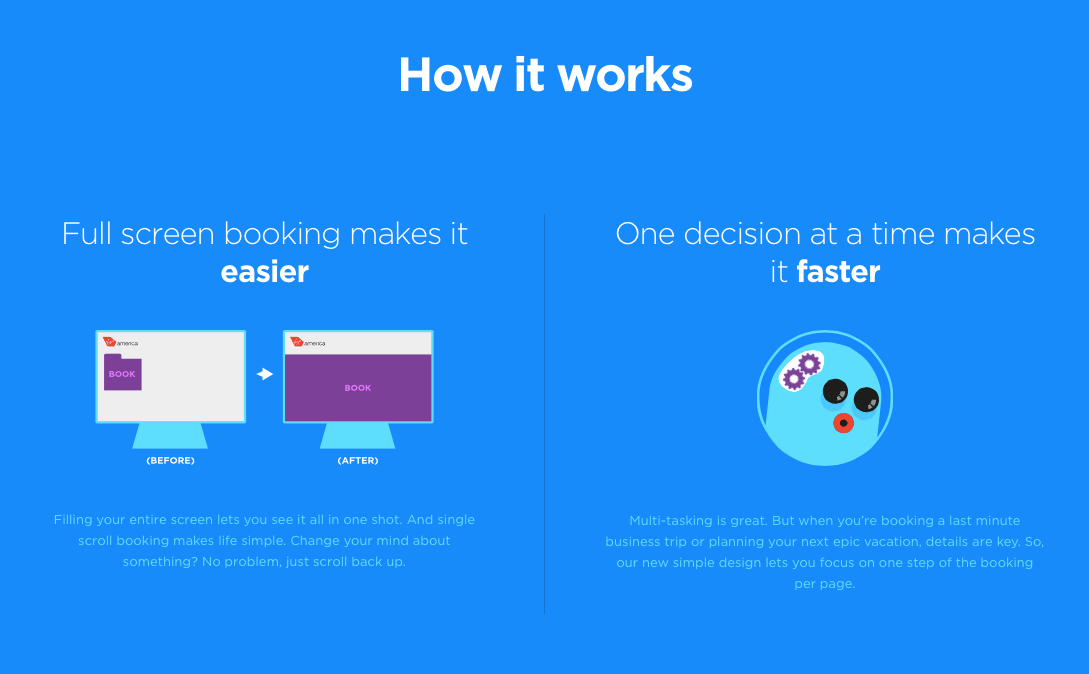
“Full screen booking makes it easier”
Filling your entire screen lets you see it all in one shot. And single scroll booking makes life simple. Change your mind about something? No problem, just scroll back up.
“One decision at a time makes it faster”
Multi-tasking is great. But when you’re booking a last minute business trip or planning your next epic vacation, details are key. So, our new simple design lets you focus on one step of the booking per page.
I used to design booking engines for a large travel company, so this is especially interesting to me. Let’s walk through the process of booking a flight to see just how great it is.
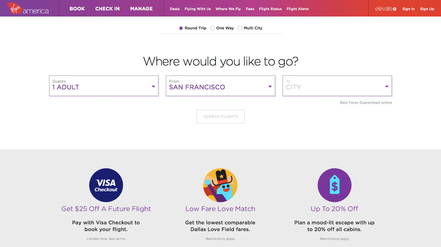
1. Where would you like to go?
That is the simple question you’re faced with on the flight destination section. With the route selection being front and center of the design, Virgin America are cearly putting the user first.
Let’s compare this to the initial experience of their American airline competitors.
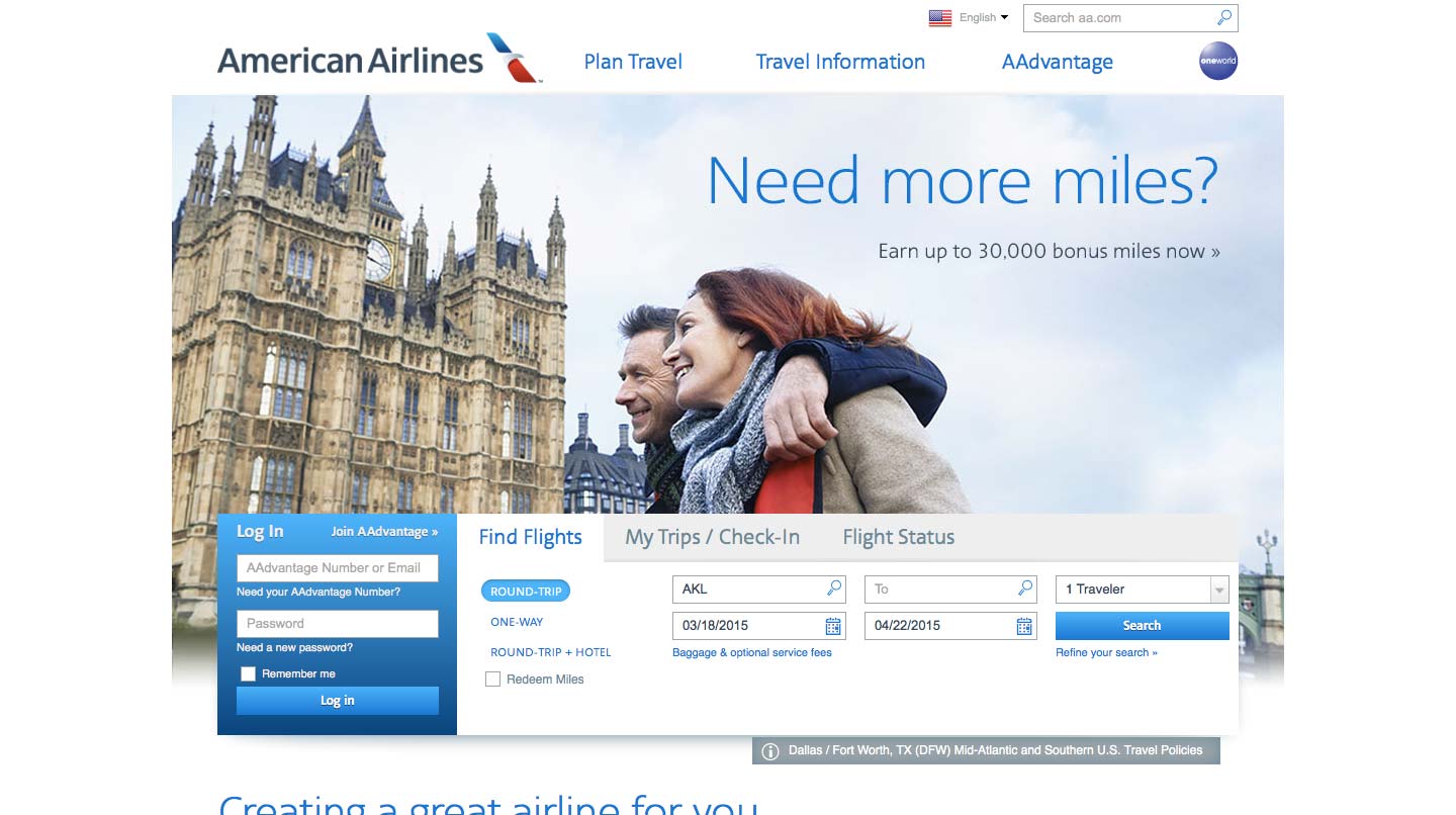
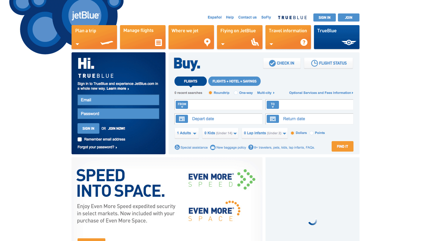
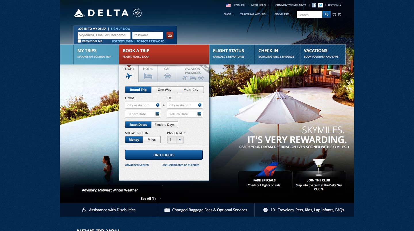
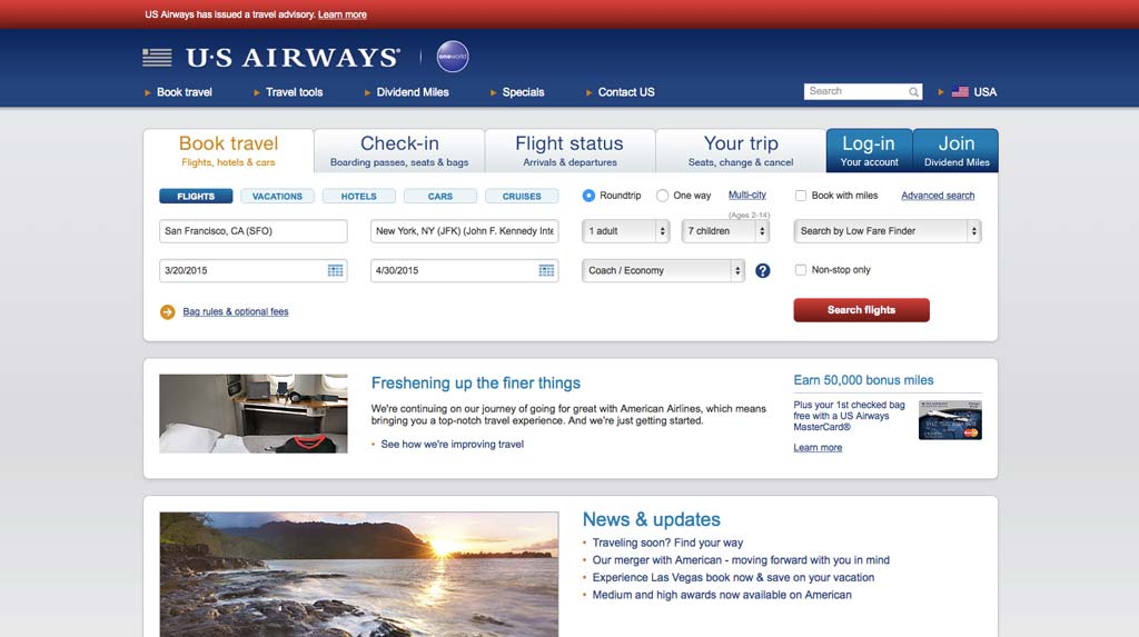
It’s clear to see Virgin America’s competitors’ homepages are more cluttered and less intuitive to use. This carries through to the rest of their experiences from what I’ve seen in briefly trying to use them.
Beyond the overall simplicity, it’s the small nuggests of attention to detail that help form the great exeperience of this first stage.
Airport Selection
The first thing I would like to highlight is how San Francisco is chosen automatically as the starting point. Although it’s impossible to know without insider information, it’s likely to be the most flown from airport (also their main hub). This is something to consider in the UI of web apps you design. If you find in usage that an option is being used much more than any other, consider setting that as the default. It can always be changed by the user of course.
Virgin America only flies between 23 different airports, so in terms of UI design, a simple dropdown for selecting airports is all that is required. They’ve even forgone the industry standard of autocomplete typing as it really isn’t necessary. They’ve designed specifically for their needs providing a better experience for their customers.
Infants
Airlines allow parents to carry infants on their lap without occupying another seat. Of course, one adult can’t have more than one infant so let’s test how the UI handles that.
It isn’t possible to select more infants than adults at this stage. Perfect.
It seems pretty obvious but you’ll be surprised how many sites don’t deal with this very well. Looking elsewhere in the industry, there are many ways other companies deal with this. Most of them involve error messages, even waiting until the next stage of the process to inform you. Virgin America elminate the need for any error messages with this simple but neat restriction.
This probably isn’t something many people will come across. I mean, it’s very unlikely parents will be carrying more infants than there are adults but it’s still something airlines have to prevent.
I’ve chosen to highlight this because it demonstrates Virgin America’s attention to detail, no matter the how small or unlikely the issue.
Multi-City
You’re presented with a different UI for selecting multi-city flights because it’s slightly more complex but Virgin America have made it as simple as it could possibly be.
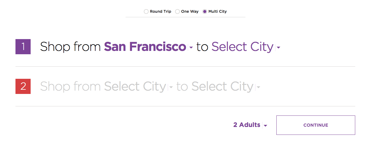
It does however only allow a selection of two flights, so you’ll have to make two separate bookings if you want add a third. There could be a couple of reasons for this. It could complicate the UX of the rest of the booking process, or their data shows that people mostly only book a couple of flights. It may be a combination of the two of course. Whatever the case, they’ve focused on usability.
The choice of wording on this option confuses me a little. “Shop from San Francisco…” is odd. Technicailly I guess you are “shopping” for airline tickets but normally people don’t say “I’m shopping for flights”. I would simply replace the word “Shop” with “Fly” as it’s much more relatable. Use phrases people actually say themselves.
2. Selecting Dates
Dates occupy the full-screen of your browser and is better for it.
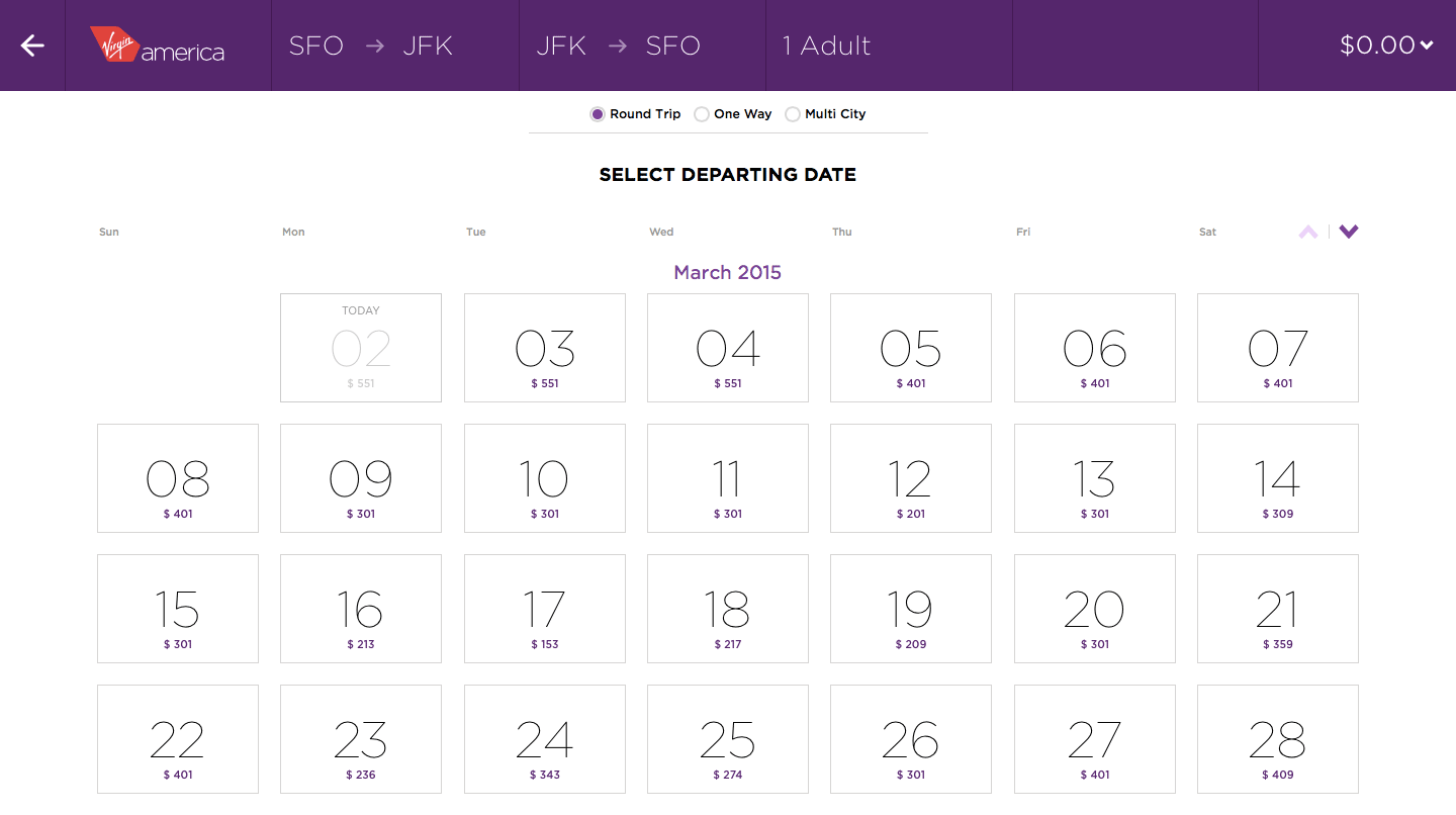
The days themselves are big enough to include the cheapest fair available on that particular day, which is obviously a huge help.
3. Selecting Flight Times
Once you’ve selected the dates you want to fly on, the times of available flights are then clearly laid out, complete with information about the number of seats left, even for each section of the plane. That’s another detail they didn’t need to include. Had they not included it at this stage, people would have to wait until they picked their seat in the next step to see if enough seats were available, leading to potential frustration if that particular flight was fully booked as they would have to go back and pick another time.
They also give you the option to view available seats at a glance by clicking/tapping the seat map option, designed to further stop people from having to click a flight just to see the seats they can choose. Not being able to sit next to a loved one is something most people want to avoid. Whether users know it’s there or not is something I would test and I’m sure they have. At least I’m sure they will have conducted user testing for the site in general, if not for this specific feature.
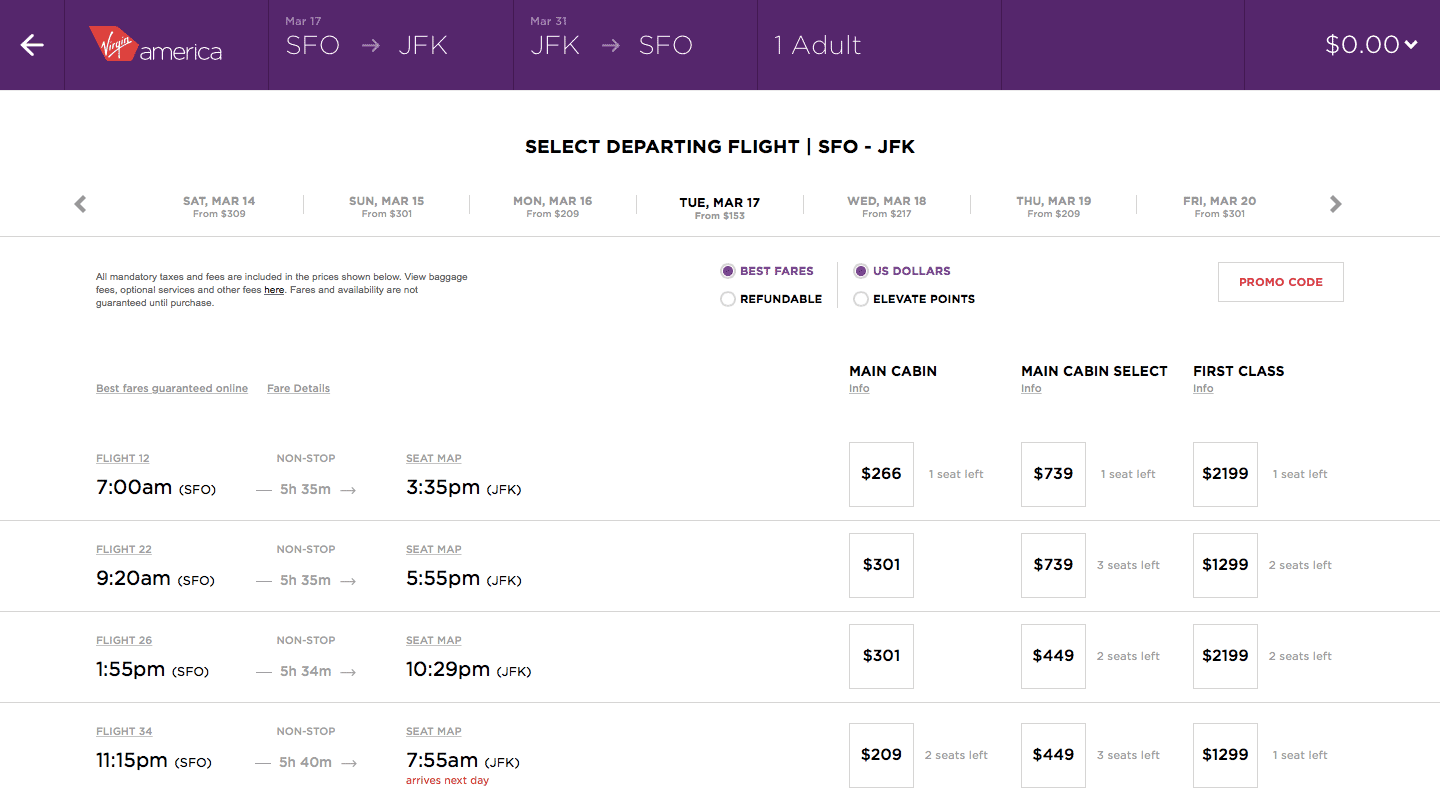
Little touches like “arrives next day” highlighted in a noticable colour are nice. You can work that out yourself pretty easily but it’s great to have a visual indicator so you can quickly scan the results for overnight flights. That’s another good example of attention to detail as it’s something they didn’t need to do but they chose to do it to create a better experience.
4. Selecting Seats
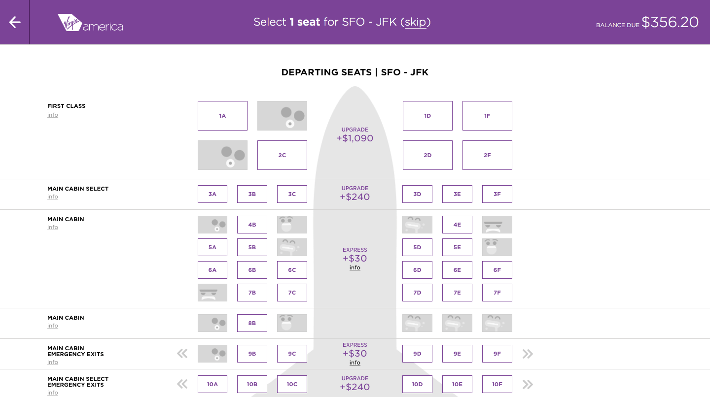
You will have most likely seen this kind of seat selection before as it’s pretty much an industry standard at this point but it’s worth showing. I certainly appreciate the clearly labelled prices for seats that cost more.
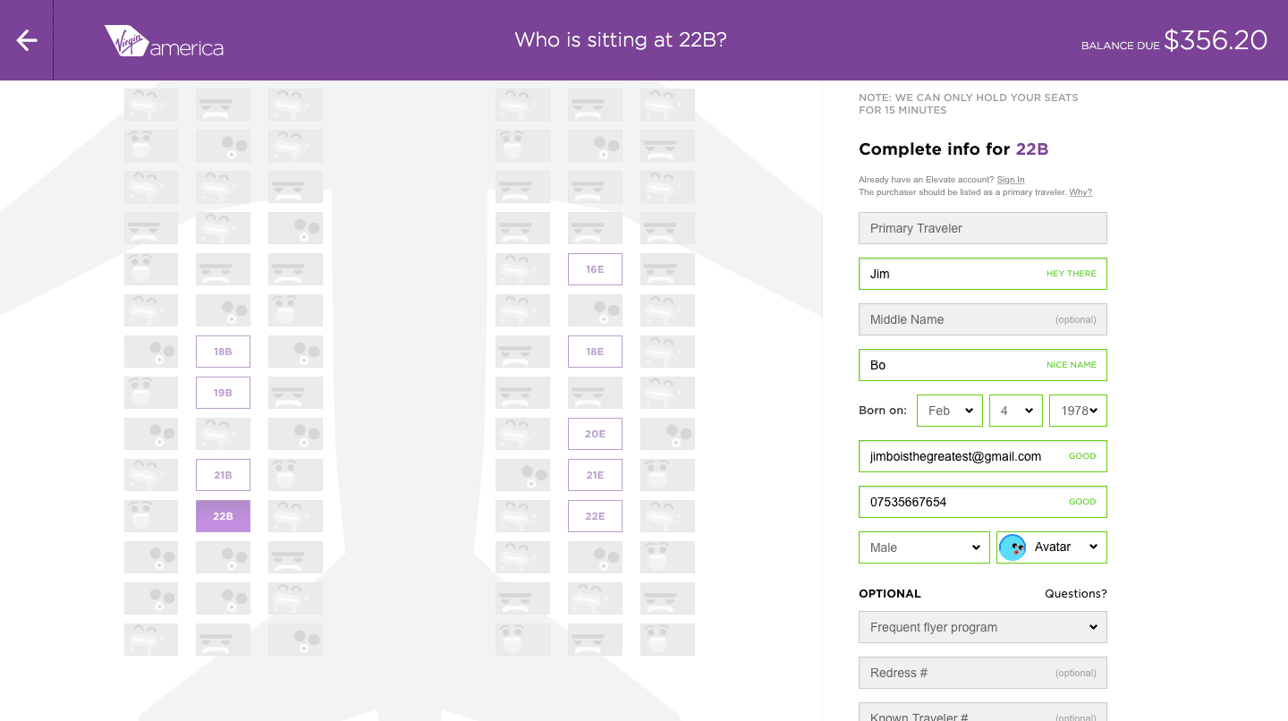
Once you’ve selected your seats, it’s time to enter some information about yourself or log in to your account. The inline form validation is very nice, providing feedback directly inside the input field without getting in the way of the information I’ve typed. Oh and thank you Virgin America for saying hi and liking my fake name!
I have to say the avatar selection seems to be a pretty pointless addition. I know they’re trying to do it to delight their customers but I don’t see how it achieves that. Perhaps it’s there to link to your account, I don’t know. I also don’t like the visual design of them but that’s my own personal opinion and for all I know, they may have tested them with many people who loved them.
5. Summary
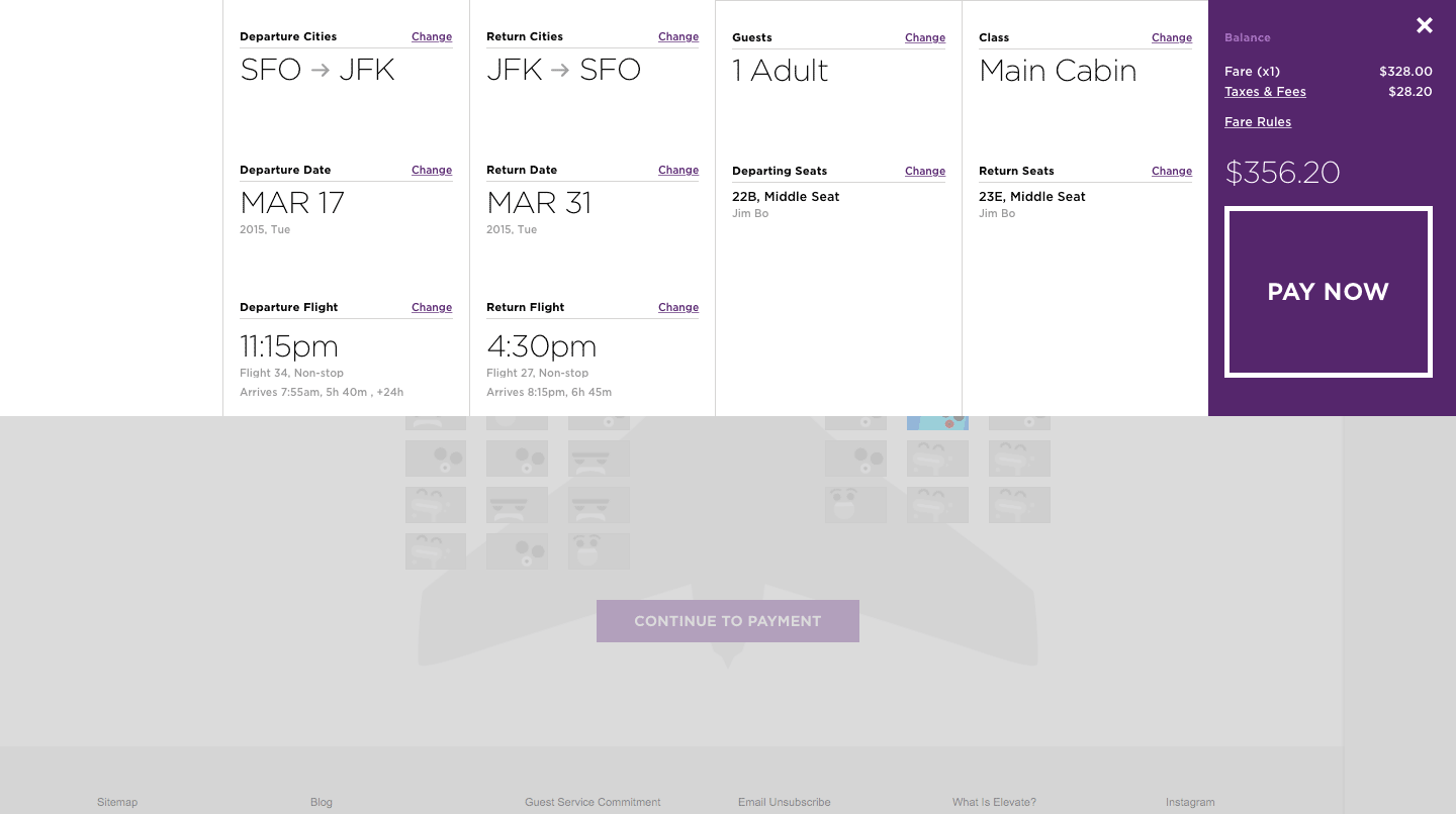
I have to say I love this part of the design. This is the section where you need to double check everything before you hand over your hard earned cash. The visual hierarchy design, mainly through typography and layout, is excellent in making the details very clear and easy to read. The grid layout is perfect for quickly scanning the details. The most important information on this section are the choices you made for your order and rightly, they are the ones that stick out the most visually thanks to the use of a larger font.
Look at that giant PAY NOW button. Don’t you just want to click it? The call-to-action is very clear, to say the least. Just as it should be.
Additional Details
The beauty of this design, is you can simply scroll up to edit anything you like thanks to the continuous full-screen layout. Most other airlines make you go back a page or two, which is obviously slower.
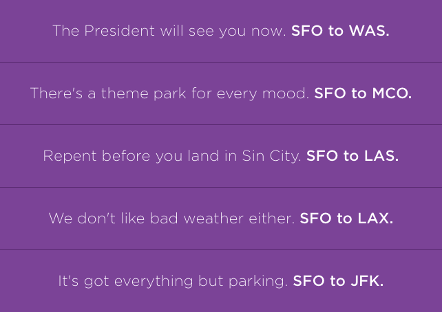
When hitting search on the initial screen and while the system loads the dates, you will see a brief message banner at the top of the page with location based messages. These messages are fun and are relevant to the place you’re flying to in a nice attempt to delight the customer while they wait.
Menu

I don’t even really need to highlight the primary and secondary menus for you because the great visual hierarchy design does the job so well. The menus are separated by dividers but also by text treatment. The primary menu’s text is all in capitals, which makes it stand out, as it should. These are the main actions visitors will perform relating to flights with the secondary menu containing secondary information about the company.
Mobile and Responsive Design
We’re experienced enough with responsive web design by now to imagine how a site like Virgin America would realign for mobile devices and it behaves exactly how you would expect.
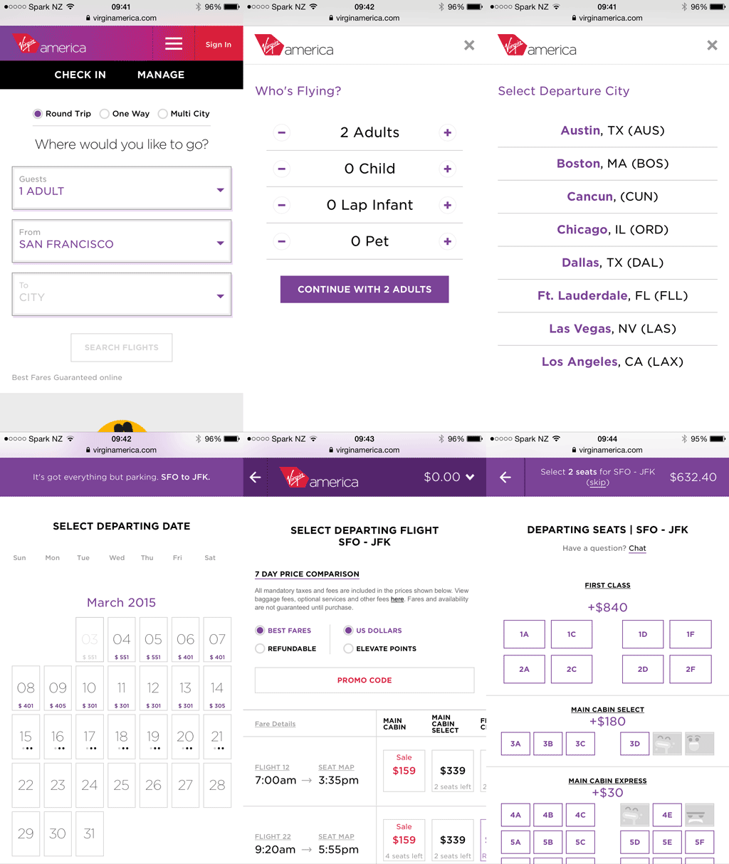
The only section I thought they would have difficulties with is the flight times section, as it contains a lot of information. Here’s a side-by-side comparison of the desktop view and the mobile view:
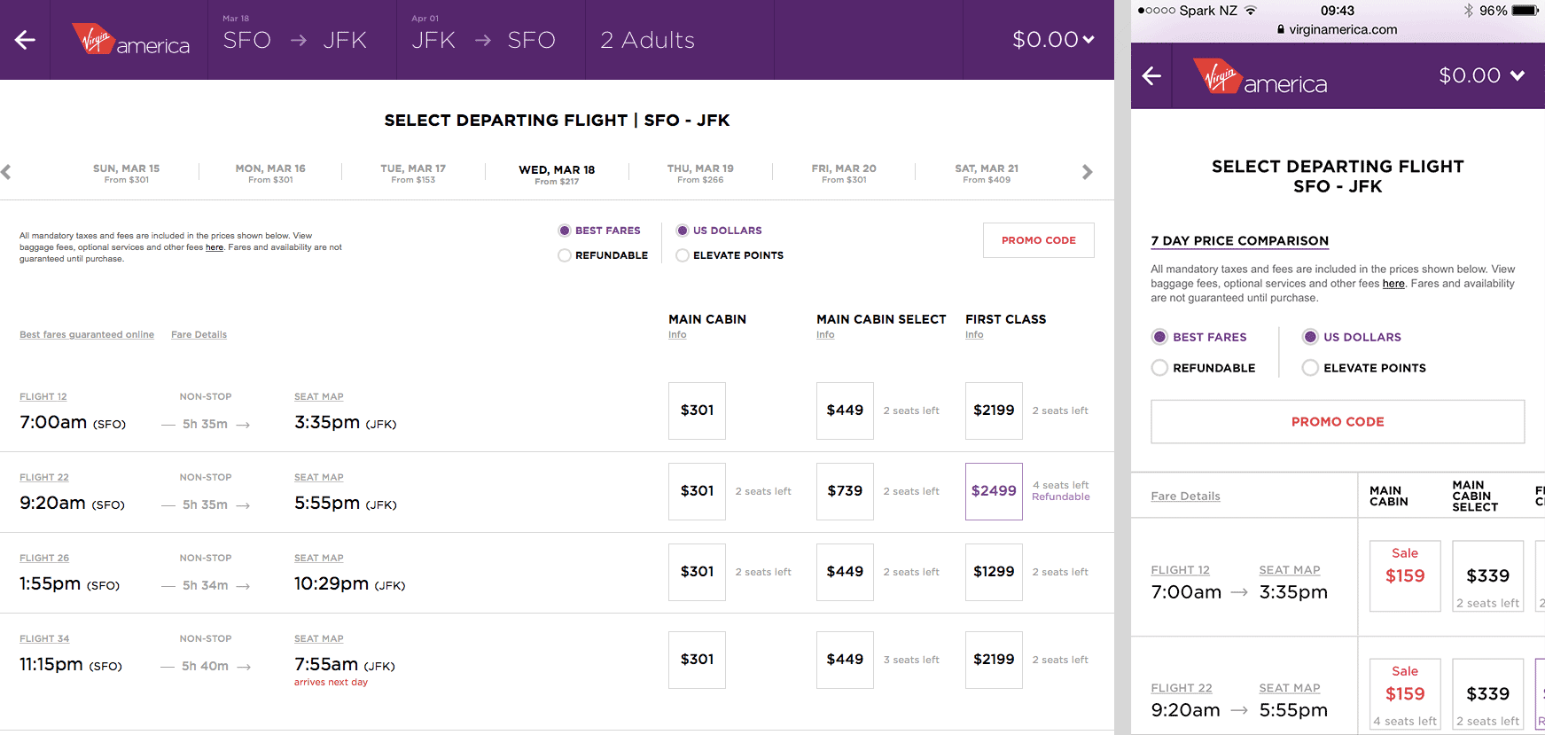
As you can see they have done a good job fitting it onto a mobile screen. What you can’t tell from the screenshot is that you have to swipe horizontally to see the table at narrower widths which is fine as you can see it has been cut off, indicating that it is scrollable.
If you look closely you will notice they have removed the flight duration time on the mobile screen. This is information that isn’t critical so it’s fine if it isn’t there, even if it is still useful. Think about the non-critical secondary or tertiary information you can hide in information dense designs like this in order for them to work better responsively.
Making Flying Good Again
Virgin America’s mission is “making flying good again” and they know that starts before you even step foot on a plane. It begins with booking the flight and they’ve actually exceeded their mission of being good. It’s great.