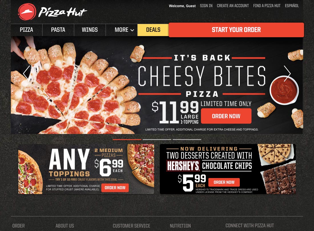
Travelling the world is tough. Sometimes the convenience of fast food after a tough day of hiking is just too tempting, no matter how unhealthy we know it is. This led to an experience with great design when using Pizza Hut’s website during our travels around America.
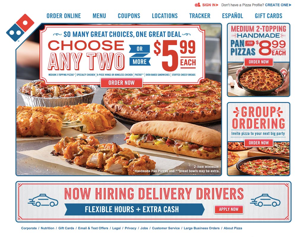
However, instead of studying only one of the leading pizza delivery companies, I’ve decided to do something slightly different with this edition of Learn from Great Design and compare Pizza Hut’s design to Domino’s website. This means there will be some learning from bad design in this issue of Learn from Great Design but it’s still just as useful as you’ll be able to see what you shouldn’t do as well as what you should do when designing for the web.
Digital Movement
As of December 2014, digital channels now account for 47 percent of Pizza Hut’s orders and over half of that comes from a mobile device. Domino’s digital orders account for roughly 40 percent of all sales, also reported in December 2014.
Online ordering is big business especially as it is approaching 50 percent of Pizza Hut and Domino’s total orders. Web (and app) design is increasingly important to the way they operate.
First Impressions


Both homepages are quite busy but Pizza Hut have clearer call-to-actions with the red contrasting nicely with the dark background. That isn’t to say Domino’s design isn’t clear though, they just don’t stand out as much. The simplicity of Pizza Hut’s photography allows for a cleaner look and more prominent call-to-actions.
...


