Once upon a time, two men were fed up with the ridiculous prices large companies were charging for razors and decided to create a business with a better and more convenient service, without sacrificing quality and at lower prices for their customers. These two men are Andy Katz-Mayfield and Jeff Raider and they created Harry’s, where you can subscribe to have shaving goods delivered to you on a regular basis.
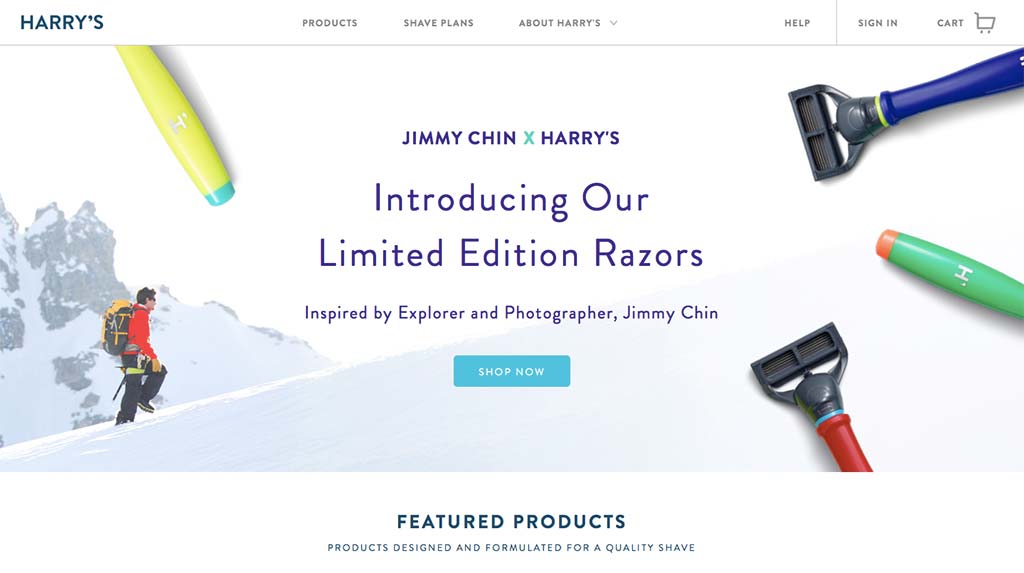
The first thing you notice about the design is the sophisticated look and feel. And it’s very important they portray a great visual aesthetic. After all, they’re selling a product to help men look their best. Would people trust them with a site that didn’t look great too? Probably not as much. First impressions count on the web as much as they do face-to-face.
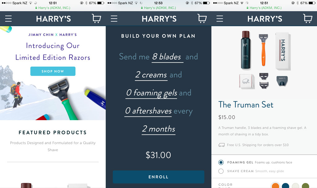
Shave Plans
The main selling point is the subscription service. You can choose from a pre-made plan:
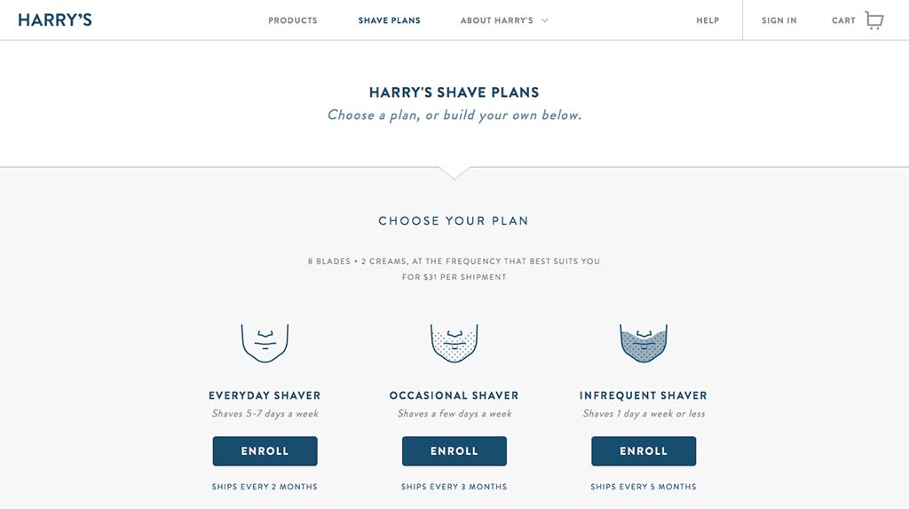
Or you can create your own shave plan:
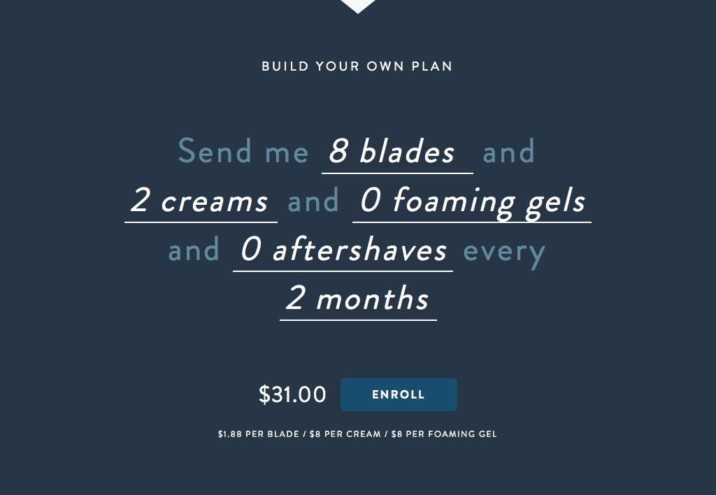
The use of natural language is a great way of literally talking to your audience, or your audience talking to you, in this case. It’s super simple to understand and it is very easy to scan and understand even if you only focus on the interactive elements. Another example of design by writing.
Update: During the process of writing this (at the last minute no less!), Harry’s have changed the design of this page and seemed to simplify it even further. It now no longer has the create your own option but only offers choice based on frequency instead.
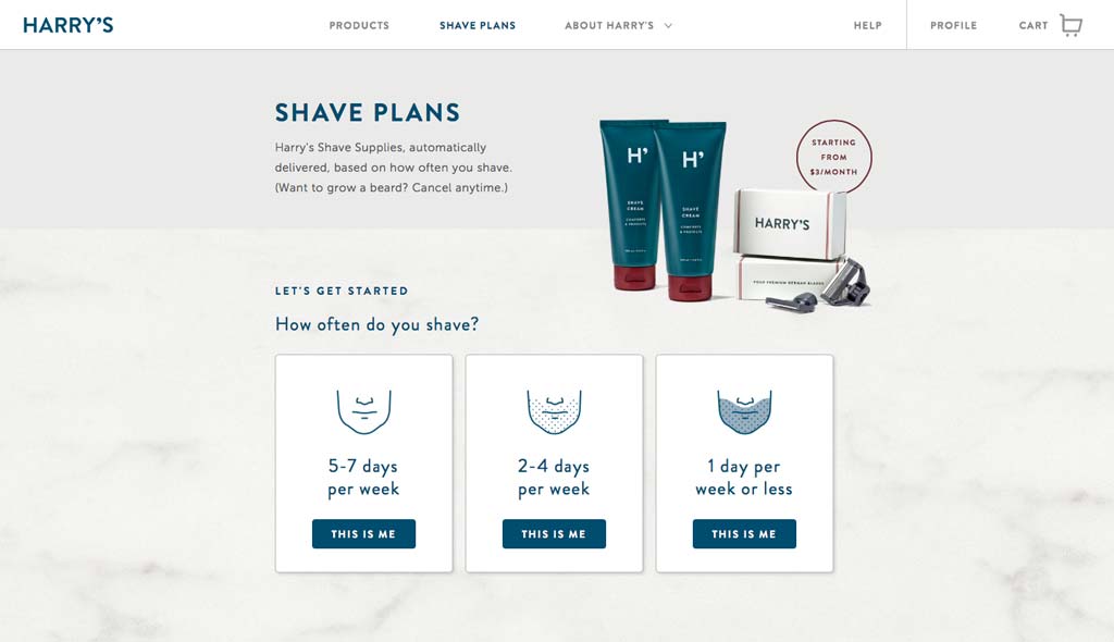
Now the simple question of “How often do you shave?” is introduced, with simplified call to action areas which visually have more weight than previously and with less wording, only focused on how often someone shaves. They’ve removed the slightly ambiguous terms “everyday shaver”, “occasional shaver” and “infrequent shaver”, which were pointless considering they had the actual frequency underneath.
Interestingly, the wording of the call to actions have changed from “Enroll” (which I always thought was a little odd) to “This is me”. This change feels much more personal and assertive. Enroll sounds too scholarly, far from the target audience.
It’s entirely possible I saw a version of an A/B test but I have no way of knowing. Perhaps they’re testing whether people will create their own by using the checkout cart page to edit quantities and add/remove items or perhaps they’ve done user testing and found this is the best way. Either way, it’s worth including so you can see the difference and possible evolution of the design.
Product Page
The product pages include fantastic looking images. As items are arranged into sets, they are laid out neatly. This practice is known as “knolling”. It’s basically a term for laying out things in a neat fashion. For Harry’s in particular, it exudes quality and there’s something to knolling that gives a real sense of attention to detail.
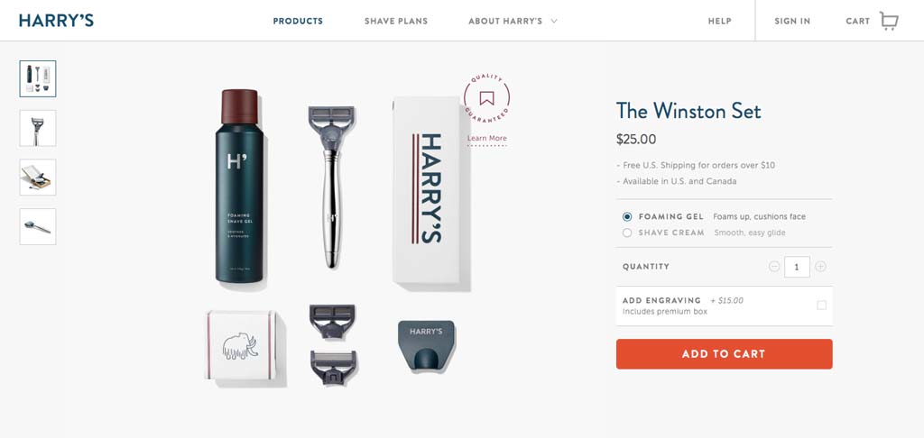
Knolling the items also allows them to swap specific items out depending on options selected on the product page. Here you’ll see the image change to include an engraving example as I’ve selected to have the handle engraved.
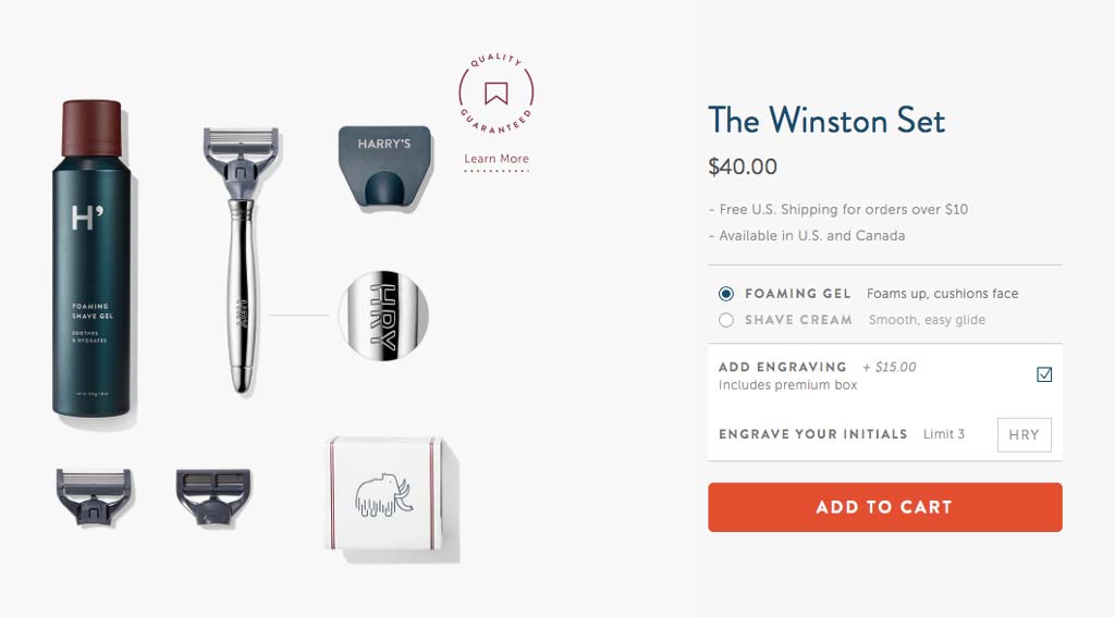
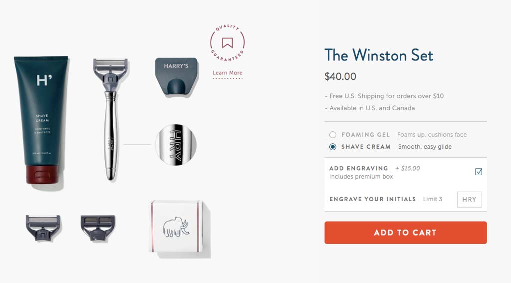
This is a very effective (and simple) way of informing the user what they have selected and what they will receive. Rather than simply selecting the option and see that as an indicator, you will see the image change to reflect your chosen selection too.
Checkout
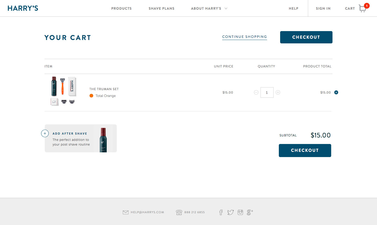
The first thing you’ll notice about the checkout page is how simple and clean it is. They do try to upsell you but it’s subtle and not annoying. In fact it will probably be helpful for some customers.
Other than the tidiness of the page design, you’ll notice the call to action is extremely prominent and in fact, appears twice on the page, giving it extra attention. I assume it is included at the top and the bottom in case there’s a large list of items but the majority of the time you will see two “Checkout” buttons, which isn’t a problem at all.
Their Story
As I believe writing is one of the most overlooked skills a web designer should have, I want to highlight some great text from Harry’s story to show you how they effectively talk to their customers.
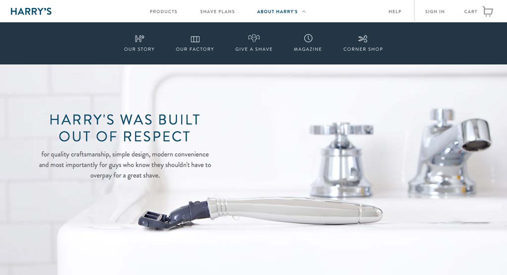
Harry’s do a great job of telling their story, as you’ll find in their about section. Here’s the very first wording on the page:
Harry’s was built out of respect for quality craftsmanship, simple design, modern convenience and most importantly for guys who know they shouldn’t have to overpay for a great shave.
“Respect”, “quality craftsmanship”, “simple”, “convenience” and “shouldn’t have to overpay” are the key words and phrases here. They are talking about everything the big companies aren’t even thinking about. They don’t have respect for anything in that list really. Gillette have only started their own subscription service because companies like Harry’s exist and could eat into their market and even then, they don’t have respect for price as they don’t seem to have reduced them.
The story supplements their offering of what their audience want with the actual service without getting in the way. It exists for those who want to go exploring to find out more about the company, so it’s in a completely different section of the navigation and never distracts from the main focus of the website.
Other Examples
I’ve already run through some wording changes on the most recent version of the shave plans page but the following text is worth noting too:
You can cancel or modify your plan at any time, no questions asked (but why would you do that?)
The decision to include the phrase “but why would you do that?” at the end of the share plans page is bold but demonstrates they have confidence in the service and products they offer, doing so in a fun and memorable way.
Special Edition
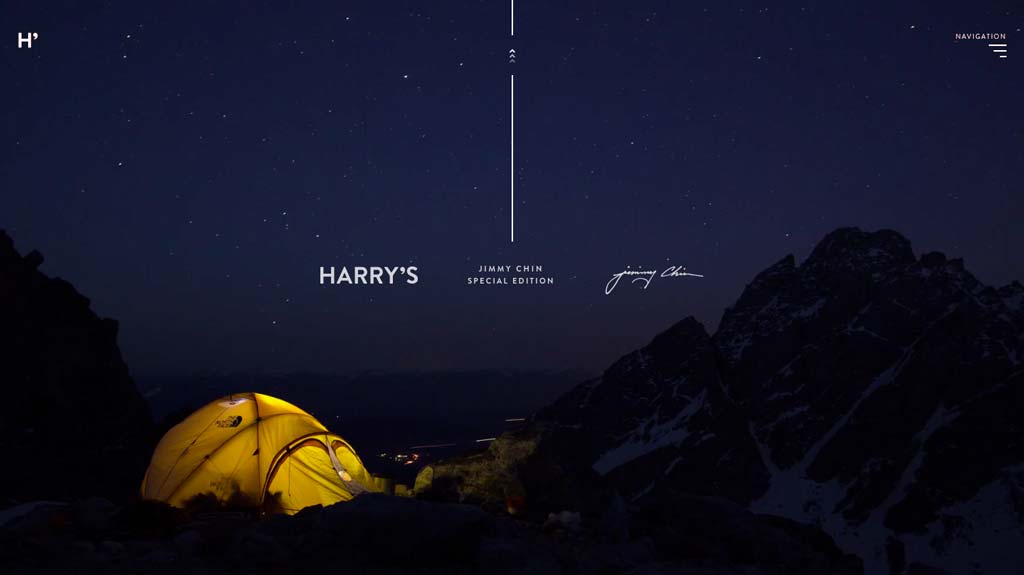
At the time of writing, Harry’s have a promotion on special editions of their razors, using some mountain climbers. They set up this interesting microsite to promote them and it is very well designed.
It does have one strange quirk though. You start at the bottom of the page and scroll up. It works well once you realise they’re using it in the context of climbing up a mountain. Even though that particular aspect feels a little odd at first, by going against the way sites are normally used (without being difficult to use), it makes it more memorable.
Mobile
Strangely, Harry’s website isn’t responsive. You would think this is the ideal design to make responsive, as anyone with any experience of responsive design can imagine how they would easily turn it into a responsive site. I’m sure you’re doing that right now.
What they do have instead is a separate mobile site, so at least they’ve created some sort of dedicated experience, rather than making people pinch and zoom.
The important thing however, is that you can do everything on the mobile site that you can do on the desktop version. It even contains the same natural language system for building your own shave plan.
I know many designers would probably scoff at it not being responsive but at the end of the day it doesn’t really matter if it is responsive or not. What really matters is the experience and they definitely haven’t compromised on that. Sure, responsive design could make development easier but the customers don’t care about that.
How are they doing?
At the end of 2014, Harry’s have raised $200 million of funding, which is staggering considering they’re not even 2 years old yet. They’ve even inspired a copy-cat company to launch the idea over here in the UK, before Harry’s make their way over here, if they decide to.
Really the magic is in the unique service (at least it was when they launched) but how much is their website helping with this? We can’t be entirely sure of course, but we do know it’s the gateway to purchasing their products and the only way to do so, so obviously it plays a major role.
The idea definitely resonates well with men who’ve had to put up with years of big companies charging almost stupid prices for what essentially are small items made of plastic and metal. The two co-founders spent the better part of two years researching the global men’s shaving market.
You can definitely say they understand mens’ appearance, given their success, and that shines through in their website. If the actual shaving experience is anything like their web design, they’re on to a winner.