I confess, I haven’t used Basecamp myself but the app isn’t the part I want to show you. I’ve extensively studied their marketing pages and that’s what I am focusing on in this edition of Learn from Great Design. I want to show you techniques you can use to help sell a product or service online to get people to convert. Basecamp have a service people love but that’s almost nothing if you can’t effectively communicate it to potential customers.
Having never used it, I can take an unbiased look into the marketing pages to see what makes them so great. I don’t even know how their product works and I’ve never needed anything like this myself but I’ve put myself in the shoes of someone looking for a great project management tool.
Homepage
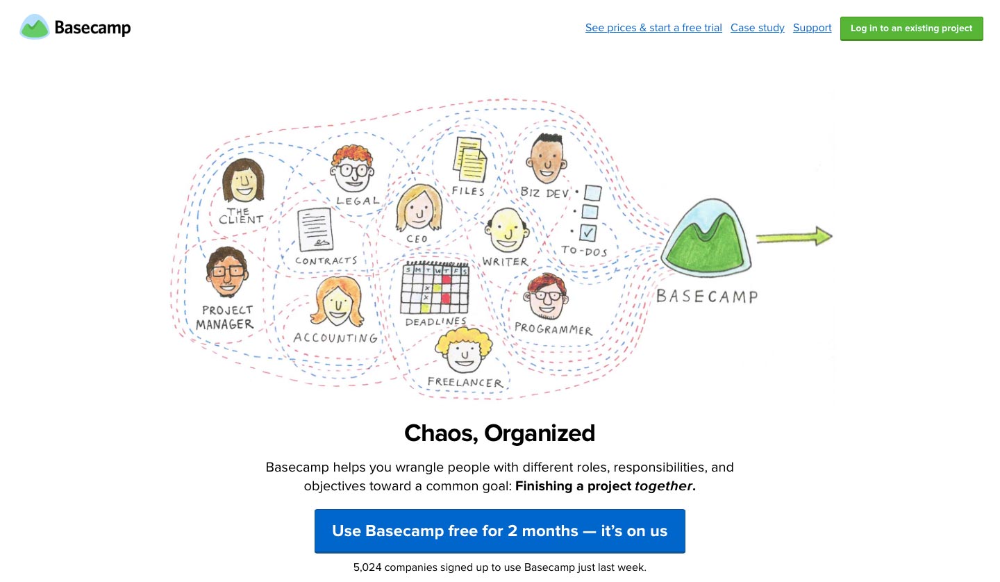
Basecamp probably aren’t going to win any awards for their visual design but design isn’t just how something looks, as we all know. Despite the simplicity though, they do have a somewhat unique style thanks to their use of illustrations.
The first thing I notice beyond the visuals when landing on their homepage, is their 2 month free trial. This amount of time is very noticeable as the standard in the SAAS (software as a service) world is 30 days. It probably is no mistake they’ve expressed it as 2 months rather than 60 days as it feels more substantial. It’s easier to think in months rather than in days because that’s how we think, especially beyond 30 days. They’ve almost certainly tested it as they’ve previously stated 60 days.
A Friendly Conversation
Next up is a mock conversation happening between “you” and Basecamp. This friendly conversation style acts as an introduction to Basecamp’s warm and friendly manner.
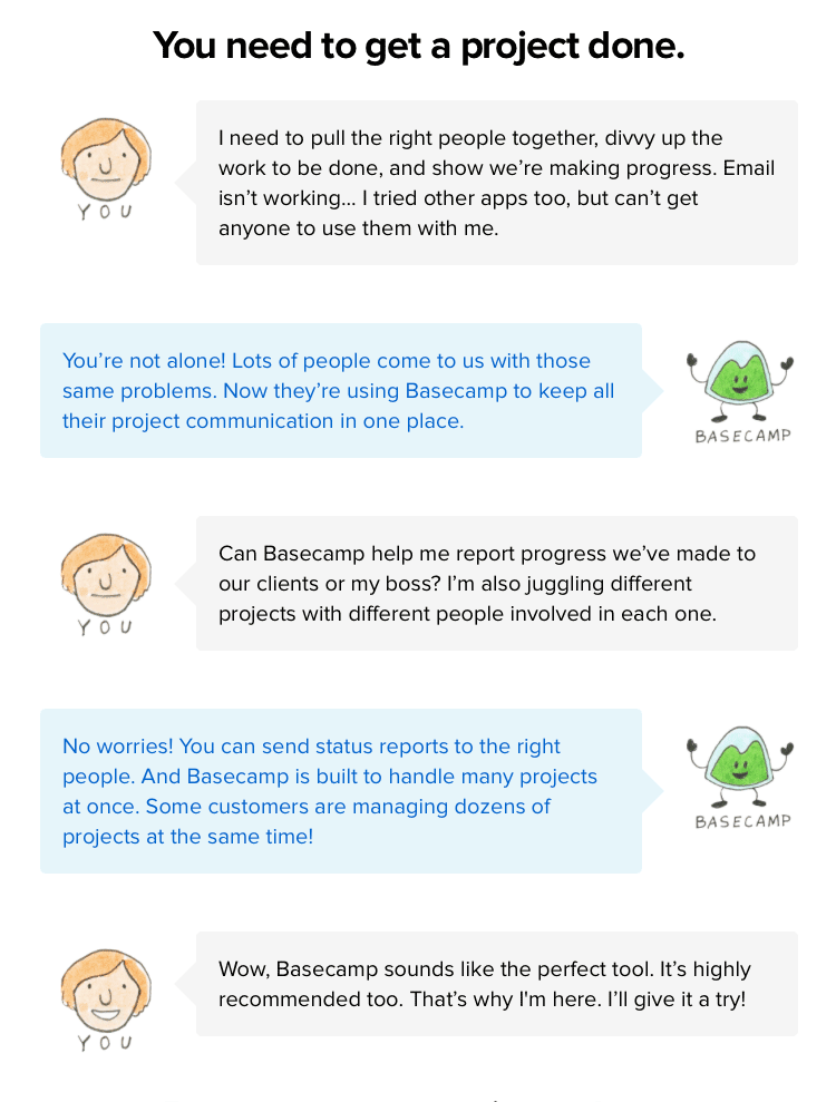
“Can Basecamp help me report progress we’ve made to our clients or my boss? I’m also juggling different projects with different people involved in each one.”
This is likely a frequent question they receive because it’s front and center on the homepage. If you can answer potential customers questions before they even think of asking, they’ll move a step closer to signing up.
The Benefits
Let’s briefly examine the copywriting for the benefits they highlight following the mock conversation:
- “On the Mac, PC, iPhone/iPad, Android and via email” – An easy one. It doesn’t matter where you are, you can use it at all times. Simple.
- “No IT Department required” – This is expert copywriting and at first glance you may not notice but let me tell you why. Basecamp is a web app used by many more people who aren’t web geeks like you or I. We know it’s a web app so it doesn’t require any manual setup beyond creating an account but the majority of users won’t necessarily know that. The people in the business approving software purchases don’t want to give their IT team more work, so this speaks straight to them. They could be the biggest barriers to stopping a company from signing up so this addresses their main problem. It also speaks to the smaller teams who don’t really have an IT setup or outsource it when they need it.
- “Can I see how other people use Basecamp”? – It isn’t easy to see how a project management tool works until you’ve used it for a while (partly why they offer a 2 month free trial instead of 30 days) so what better way than to see other successful companies’ actual projects including a case study which we’ll have a look at later.
- “Free weekly classes + live Q&A” – Who else does this? I haven’t seen anyone else do this, so as it is something almost no-one else does, it stands out. If you can over-deliver, do it. The 2 month trial is another example of over-delivering. Over-delivering delights observers and turns them into customers.
Signing Up
The headline on the signup page reads: “Just last week, 5,024 companies signed up for Basecamp.” Why wouldn’t you complete the simple signup form if thousands of companies have signed up in the last week alone? This number automatically updates any time you visit and while that is a clever technical implementation the real benefit is social proof.
Social proof is when people are positively influenced by the actions of others. If other people are doing something then you are more likely to join in because you don’t want to miss out on what everyone else has.
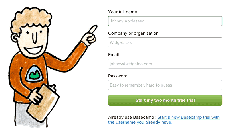
This is very interesting and fun! The guy on the left points to each input field you are currently on. They’ve crafted their unique illustration style into something useful and delightful.
Even though it is only a drawing, it feels like someone is helping you out even at this stage. The clipboard and Basecamp t-shirt help make that point too.
Studies show that we instinctively notice other people on websites (see number 2) and we also take note of what they are looking at. In the case of the friendly helper here, he points at the form while looking at you.
I’ve never seen a form interaction like this before. Just goes to show great new ideas are possible in this seemingly over-saturated world.
Looking beyond this fascinating interaction, pay attention to the button text: “Start my two month free trial”. The benefit of signing up is embedded right into the button itself. Make the incentive become the button. It’s so much more human and appealing than “Sign up” or “Join now”.
Case Study
In the last edition of Learn from Great design, Rally Interactive’s excellent case studies were the star of the show and despite not being a design agency, Basecamp use a case study to great effect. Case studies aren’t just for portfolios. When designing for a product or service like Basecamp, consider creating a case study or two to really show how people can be successful using it. People want to know how they can be successful with a product. Show them.
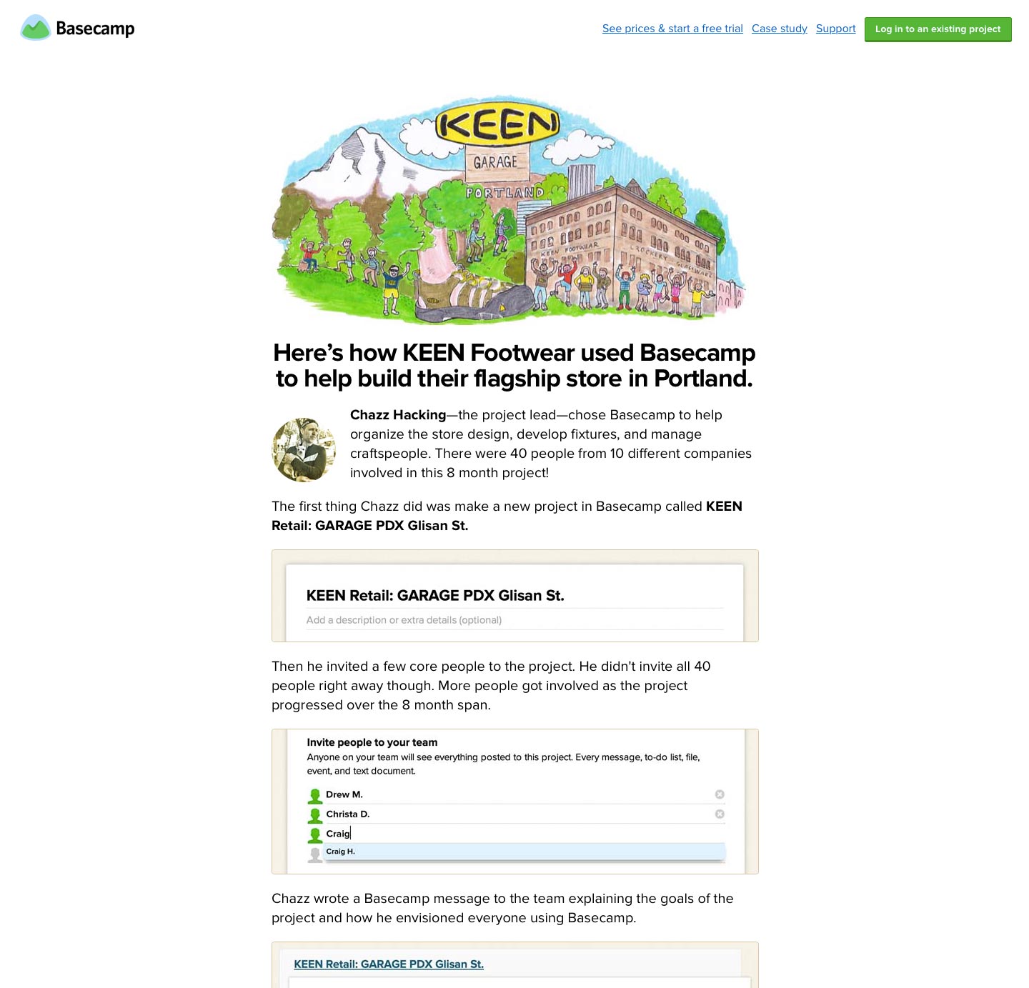
They literally walk you through the process of how a footwear company built their flagship store, complete with screenshots. It’s simply the best way to see how Basecamp is used without actually using it yourself.
Right at the end of the case study is the sign up button, which interestingly says 60 days, not 2 months. Giving people the option to signup immediately after a case study is a prime time to get them on board especially if they like what they’ve seen. Make it easy for them to sign up at this stage.
Support
“We do whatever it takes to make sure our customer service is the best in the business.”
Basecamp really want you to know they are there to help, so much so they even have a real-time count of customer service rating:”Out of our last 100 customers, 95% say our customer service was great!”.
Throughout the site, Basecamp pitch themselves as a friendly, helpful company. Just look at the mascot on the homepage and the friendly guy helping you on the form on the sign-up page. Both are great examples of emphasising Basecamp’s willingness to help and be there for their customers.
On the surface, it’s nothing more than a neat gimmick designed to make people smile, which has value of course but but dig deeper and you’ll notice it’s a part of an overall narrative. One that tells the story of how useful Basecamp are, not just in the product they have but the customer service they provide too.
Tell a Story
Basecamp haven’t just listed a bunch of features and given you a price. They’ve painted an overall picture of who they are through a story. I’m not talking about a typical story with a beginning, middle and end but one that gives the visitor an idea of what they’ll be getting if they sign up, consistently throughout the site.
Smart use of social proof and telling a story of their dedication to customer service while also over-delivering have helped Basecamp tremendously and you could do the same for your next project if you learn from this great design.