Overview
Once upon a time, DK.com was hindered by confusing UX design and an outdated visual design. Everyday, users struggled to use the site and weren't impressed with the visual design, leading to low engagement.
One day, I led a redesign to streamline navigation, improve the overall UX design and modernise the visual design to better reflect DK’s high quality brand identity using techniques such as competitor analysis, card sorting, wireframes, user testing, feedback surveys, heatmap analysis and more.
Because of that, the user experience significantly improved. Until finally, DK.com emerged as a user friendly platform, empowering visitors to explore with ease, enhancing satisfaction and business success.
My role:
I was the sole designer leading the entire UX design strategy, including all aspects of research. I also designed the visuals and the UI.
I collaborated closely with multiple project managers, front-end and back-end developers and DK's design director.
Design Process
Analysis of Existing Design Shortcomings
Upon reviewing the previous design, several significant issues were identified that negatively affected the user experience:
User Feedback and Testing Insights
-
Complex and Confusing Navigation:
Users found the site's navigation system unintuitive and confusing, leading to low engagement and poor click-through rates to category pages. Key sections like "Explore" and "Brands" were particularly problematic, receiving minimal interaction and negative feedback during testing.
- Specifically, testers weren’t aware what “Explore” meant, so they expressed that they wouldn’t click on it. It contains articles, competitions, polls and other content but it was too ambiguous to understand.
- When asked what types of books DK sold, most testers were aware of DK's most popular categories such as travel, reference, children and education but only a small number were aware of the full range of topics DK covered.

- Inconsistent and Dated Brand Presentation: The website's design failed to effectively communicate DK’s brand identity, appearing outdated to testers.
- Better book previews: I surveyed users to see what would better help them make a decision to purchase a book. The number one result was better book previews.
UX Research
To identify the problems mentioned, and to explore solutions, I employed a combination of qualitative and quantitative research methods:
- User Testing: Conducted usability testing sessions with users to observe their interactions with the website. Through tasks and scenarios, I gauged users' navigation patterns and observed any confusion or hesitation encountered while navigating the main menu and exploring different sections.
- Analytics Review: Using analytics tools such as Google Analytics and heatmaps and other data from Hotjar, I studied data including bounce rates, session duration, and clickthrough rates. Low clickthrough rates to category pages and specific sections like "Brands" and "Explore" were flagged as areas of concern, following on from user testing.
- Card Sorting: Due to the range of categories, there were a number of sub-categories that could fit into multiple top-level categories. We performed card sorting exercises with users to get a better understanding of how they made sense of the category organisation, so we could allow people to browse by their expectations rather than the business’s way of organising.
- Surveys and Feedback: I deployed user surveys and feedback forms to gather insights from a broader audience. By asking targeted questions about navigation preferences and understanding what people needed to improve help them make a decision to buy a book, I captured user perceptions and pain points to help us understand what we could do to improve their experience.
- Competitive Analysis: I conducted a comparative analysis of competitor websites to benchmark DK.com's navigation and content organisation against industry standards and best practices. Discrepancies and areas for improvement were identified through this analysis.
- I used a service called Baymard who specialise in UX research of ecommerce websites and have tens of thousands of hours of research. This gave us an incredible foundation to build from.
By combining these research methods, I was able to uncover the specific issues related to confusion in navigating the main menu, low engagement with category pages, and user uncertainty regarding the purpose of sections like "Explore" and "Brands." These insights guided the subsequent design efforts aimed at addressing these shortcomings and enhancing the overall user experience.
Initial Goals for the Redesign
- Increase navigation clarity to ensure that users could easily understand and navigate the site effectively.
- Increase awareness of the broad range of topics that DK creates books for.
- Revamping the visual design to reflect a more contemporary and appealing aesthetic that represents DK’s brand identity effectively.
- Improve book previews.
By addressing these key areas, the redesign aimed to significantly improve the overall user experience on the site.
Ideation
Navigation Wireframes

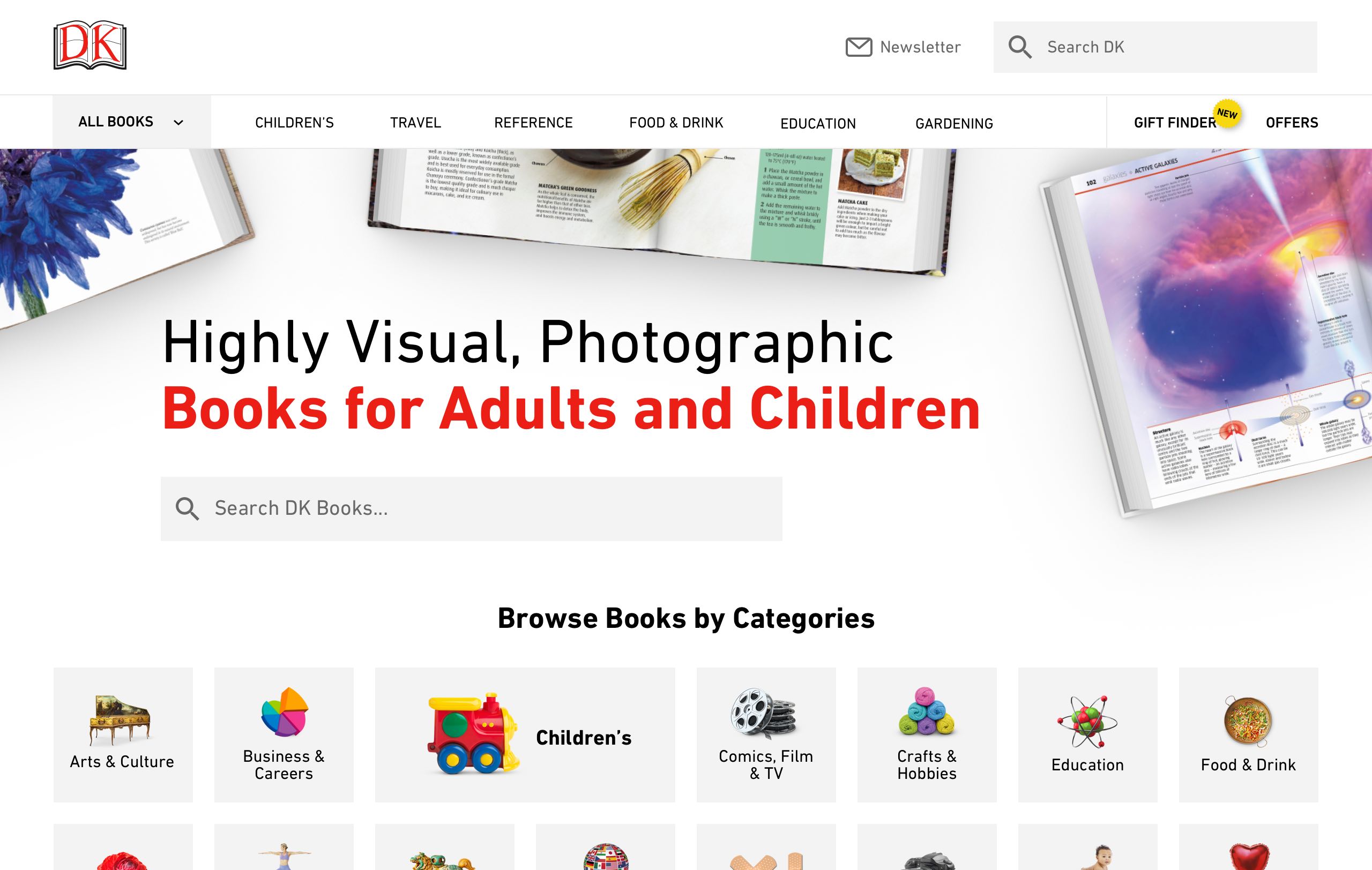
I first looked at the navigation by exposing the most visited categories so the visitor immediately sees at least 5-7 categories without having to take any action. 'Explore' has been replaced by the much more understandable 'Articles'.

Then I realised search was prominent enough for visitors who know exactly what they're looking for. Even though clicking/tapping the search icon or a search text input is the same number of actions, the text input is much more prominent.
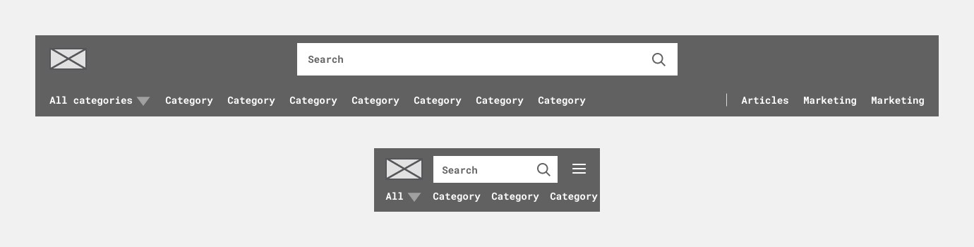
To accommodate marketing requests for promotional space, I added two prominent areas on the right-hand side for seasonal collections and other highlights. Additionally, I introduced an 'All' dropdown for comprehensive category visibility.
In collaboration with the front-end team, we optimised navigation for varying screen sizes, implementing dynamic category adjustments and horizontal scrolling on mobile devices for better accessibility.
Browse vs Search
Both search and browse are crucial for meeting different user needs. Users engage with a website either with a clear intent to find something specific (search) or to explore and discover new options (browse).
Baymard
Research from Baymard's extensive research database indicated we should approach browsing and searching in one key way.
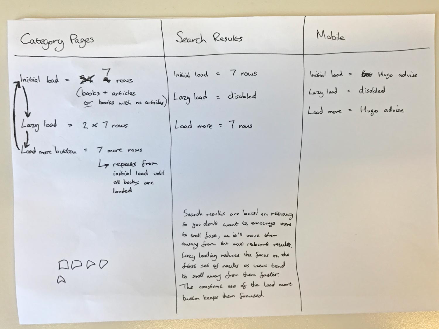
The notes above rough notes for working out how many books appear on category pages and search result pages. It came from a discussion with the front-end developer, Hugo, after discussing how to optimise for performance.
Category Pages
I decided to increase the number of books a user sees on category pages, to encourage users to browse the vast range of books available.
For performance reasons, instead of showing all books at once, we decided to lazy load blocks of books (7 rows, 28 books) as a user scrolled and then add a load more button. Pressing that repeats the process.
Search Results Page
The opposite is true for someone looking for something specific. Search results are optimised for the most relevant at the top, so I didn't actually want people to scroll too far from them, too quickly.
Lazy loading more blocks of books was disabled to add the necessary friction.
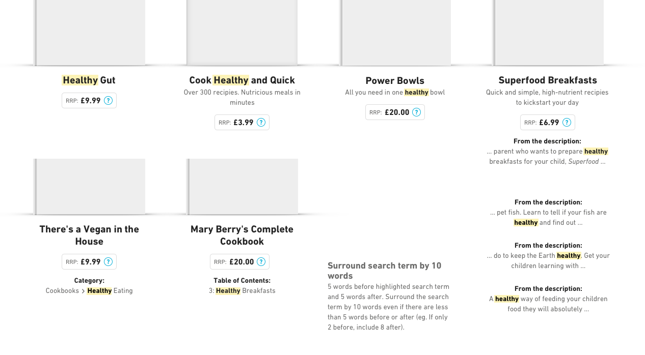
Additionally within search, I advocated for search snippets to give users context on each book appearing in your results, whether it's from the title, description, category or table of contents.
Implementation and Results
Navigation
The redesigned navigation exposed some categories to enable immediate navigation to key categories and also present a wider range of topics DK cover.


We used data to pick the most popular categories to display. As there is limited space available, the goal is to help as many of our users as possible.
Testers of the new design were pleasantly surprised by the number of categories when they saw more of them immediately.
The new navigation design increased clicks from the homepage to a category page by more than 11 times
Visitors were exploring our wide range of books in a way they weren't before and that's great for DK.
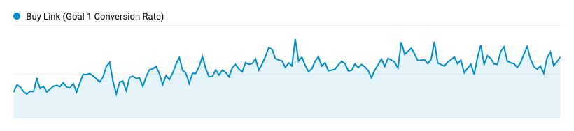
Conversion Rates
Affiliate click conversion rates increased by 30% after the redesign
That was at the 3 month period after the redesign. Since then, it has continued to steadily grow as we work towards the goal of inspiring visitors to buy and read DK's books.
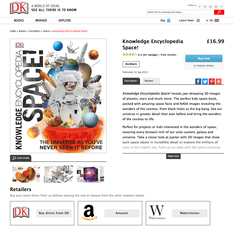
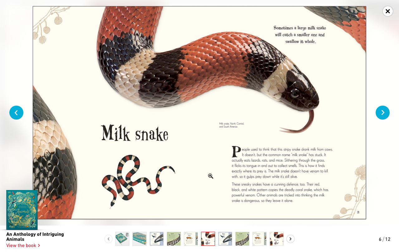
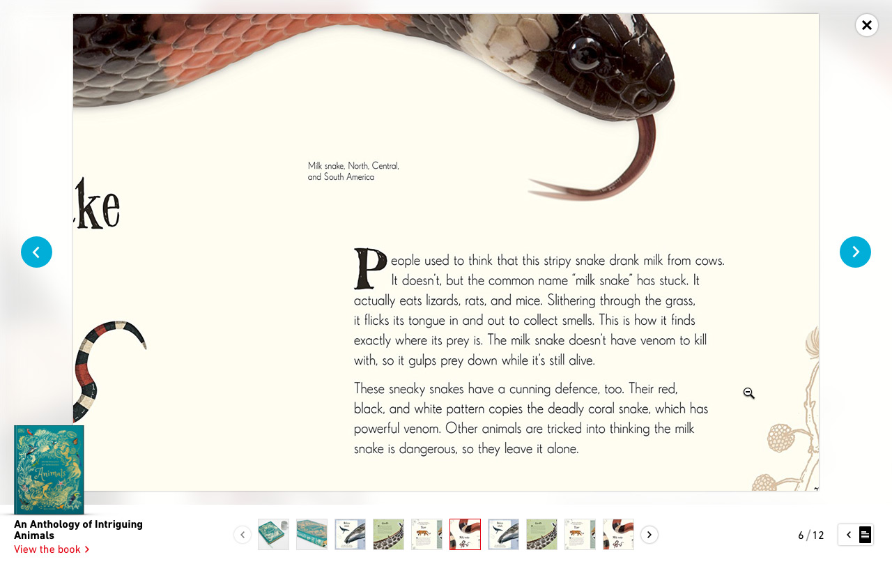
Better Book Previews
As I found in my research, people wanted better previews of the books on offer. One of the key aspects of the redesign was giving the ability for users to zoom into the page samples on the each book page so they can actually read the text on the pages which is especially useful for mobile devices.
I worked closely with the front-end developer, Hugo, to come up with a solution that balanced performance (both from an interaction point of view but also page load speed) with usability.
Visual Design
I asked myself what makes DK’s books so great? I studied a number of books dotted around the office and discovered one standout way that could be translated into the website to solve the issue of testers feeling like the website failed to effectively communicate DK’s brand identity.
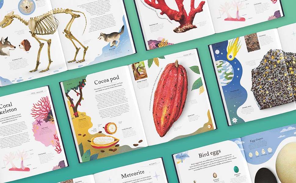
One of the key visual design aspects of a lot of DK books are 'cutout' images as seen in the images see above. They are time consuming to create but give a very distinctive look.
DK's Commitment to Design
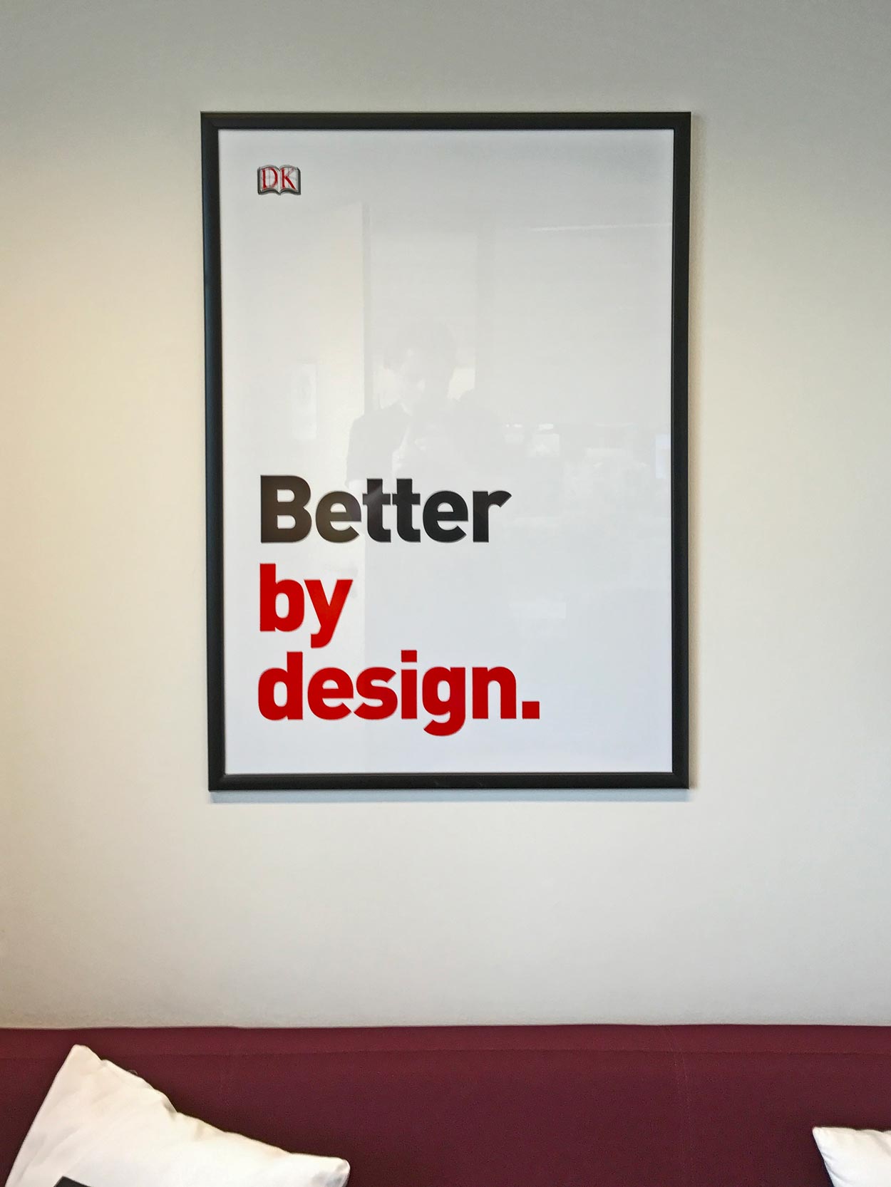
This was a poster DK had up in one of their meeting rooms. I actually took this photo during my interview and it inspired me every time I saw it.
I pitched the idea of using cutout images to represent the top-level categories to the design director of the entire company.
The concerns were that this would be a time consuming task for an already extremely busy creative team who were already busy designing books.
Thanks to the hard work of the design director and his creative team, they took the time and applied attention to detail DK have become know for to enhance the category pages in the DK way.
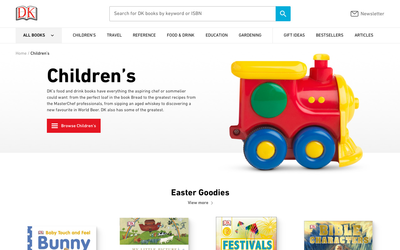
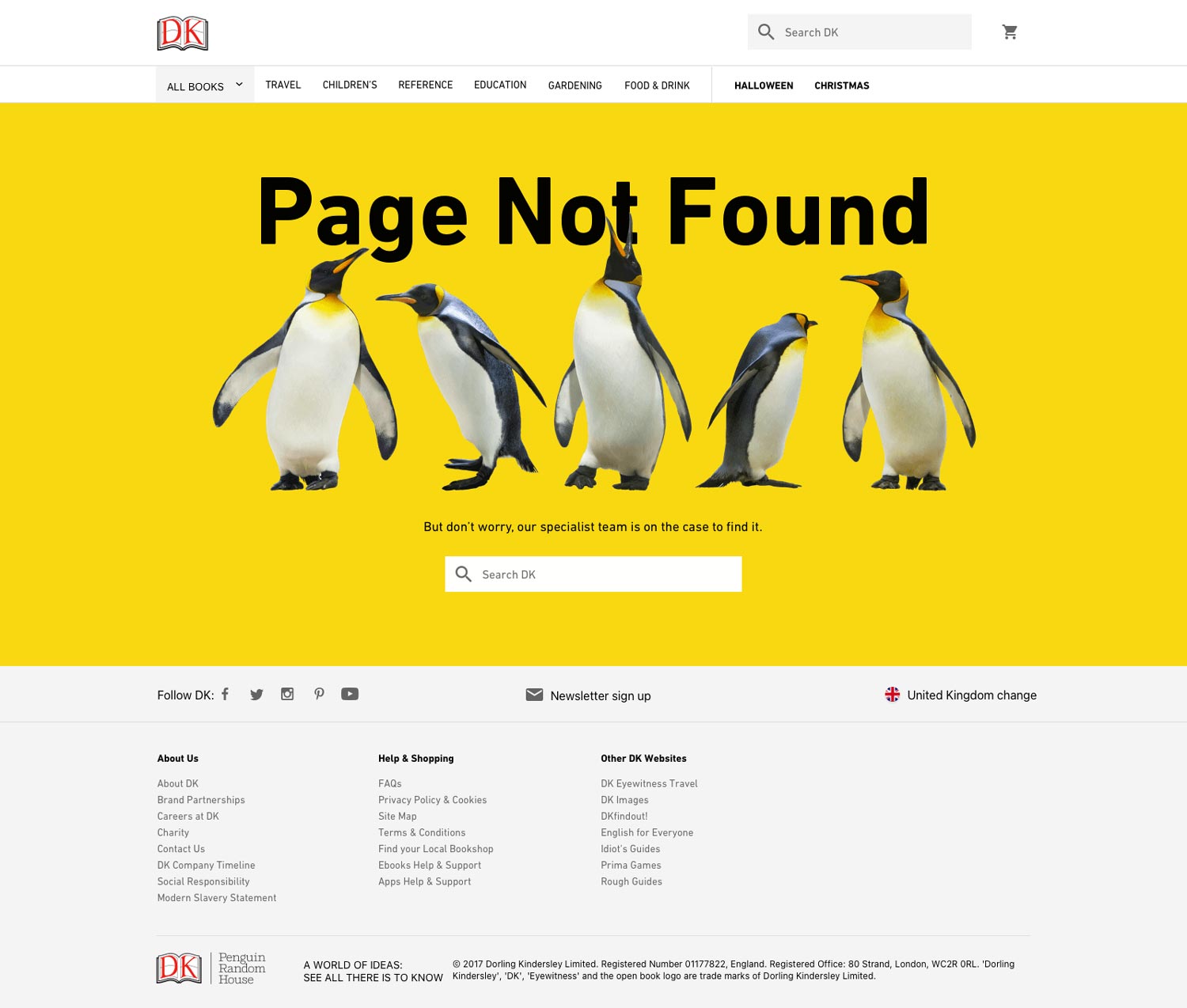
Part of my pitch was they could be reusable in marketing materials and other areas on the site, like a 404 page:
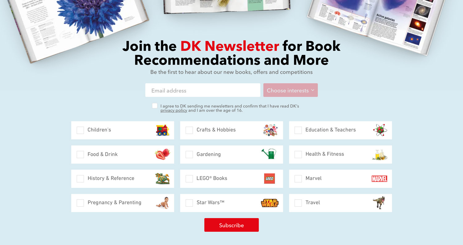
And the newsletter signup categories:

A Better Starting Point
As we know users will browse to categories more when we expose them in the navigation. This is a concept I created to show all the categories on the homepage, complete with the category icons to see if this helps users get to where they want to go faster and help visitors get an immediate sense of the full range of books DK publish.
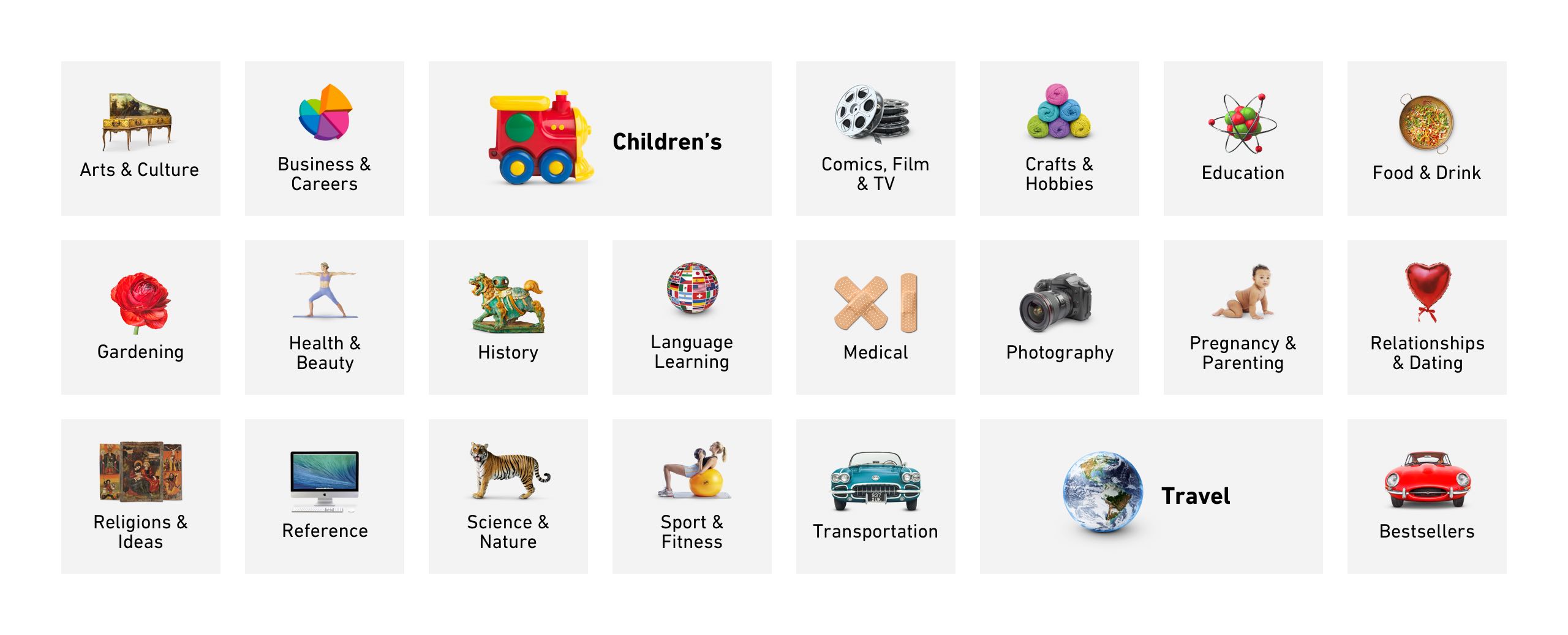
This is the full range of top-level categories and is one of the first things a visitor sees when landing on the homepage, which will certainly demonstrate the breadth of books available.
Category Specific Navigation
I’ve taken the concept of exposing navigation further by exposing category specific navigation on relevant pages. These options can be reached via a "Browse" button on the category page which brings up a menu but category specific navigation deserve greater importance.
70% of users browsing for Children’s items on Amazon browse by age. As soon as we discovered this, I put the age range selections front and center with an appropriately playful and colourful design (using our brand colours), giving users the opportunity to browse by age without having to hunt around for them. They're just there for them to use immediately.

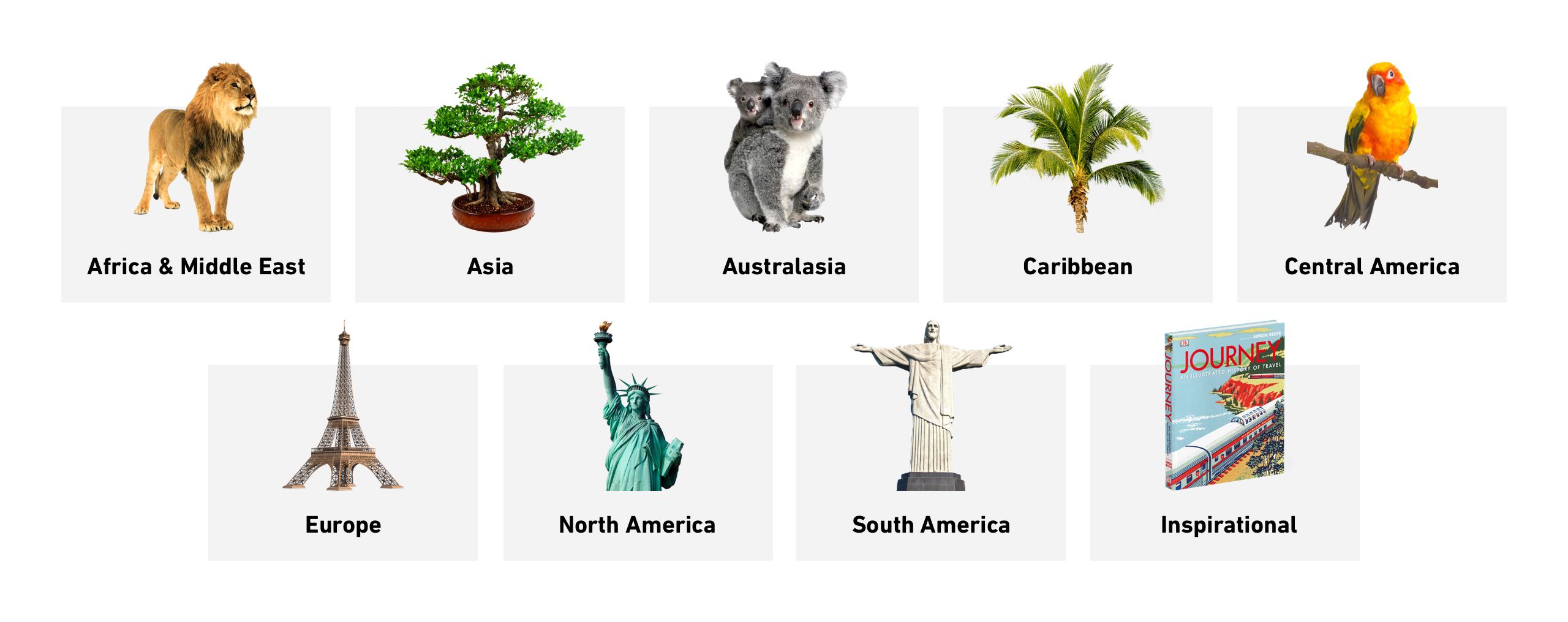
The same thinking is being applied to the travel category too. DK are known for their strong photography "cutouts", so as you may have noticed, I'm using them prominently across the site in the new design to give it that classic DK "feel".
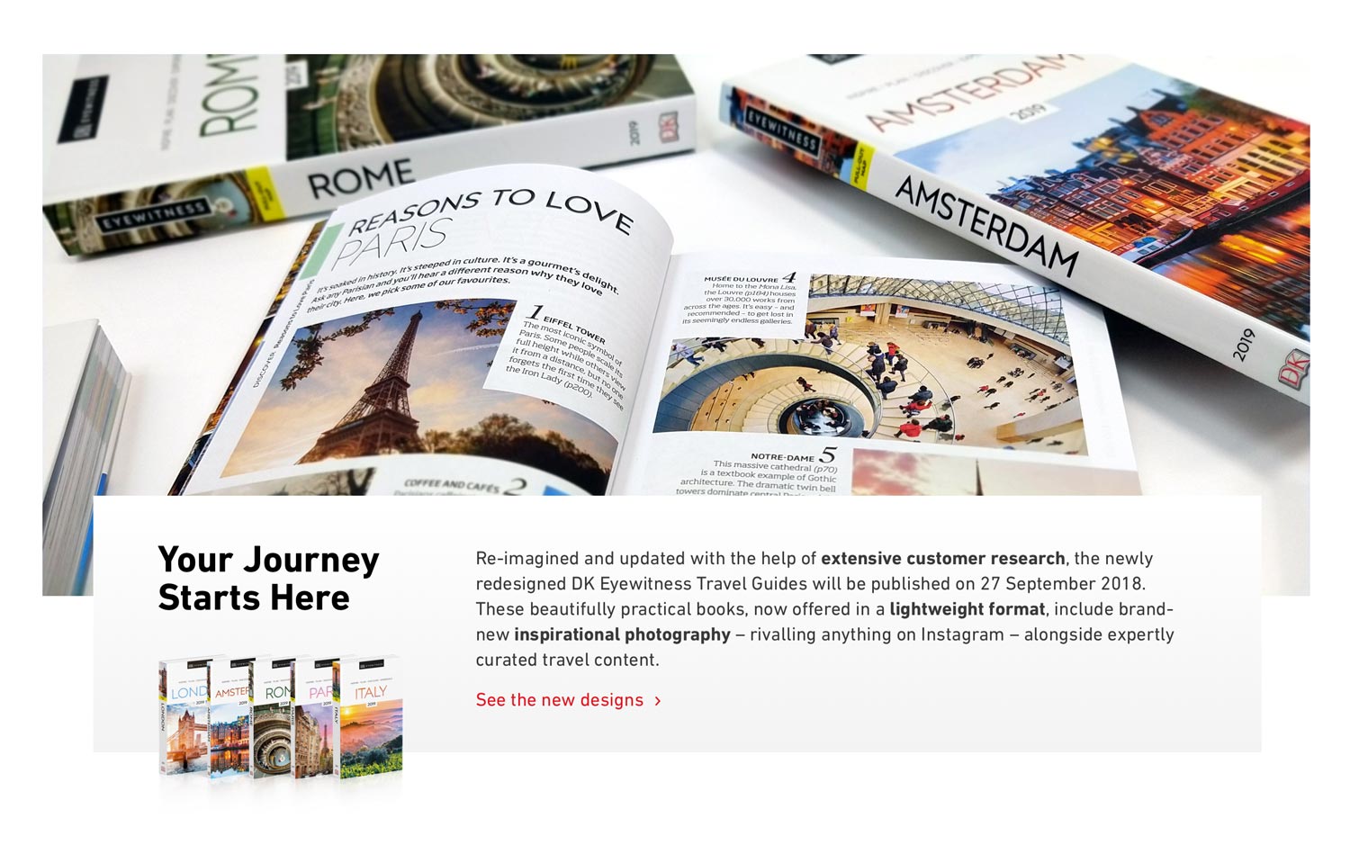
Seeing is Believing
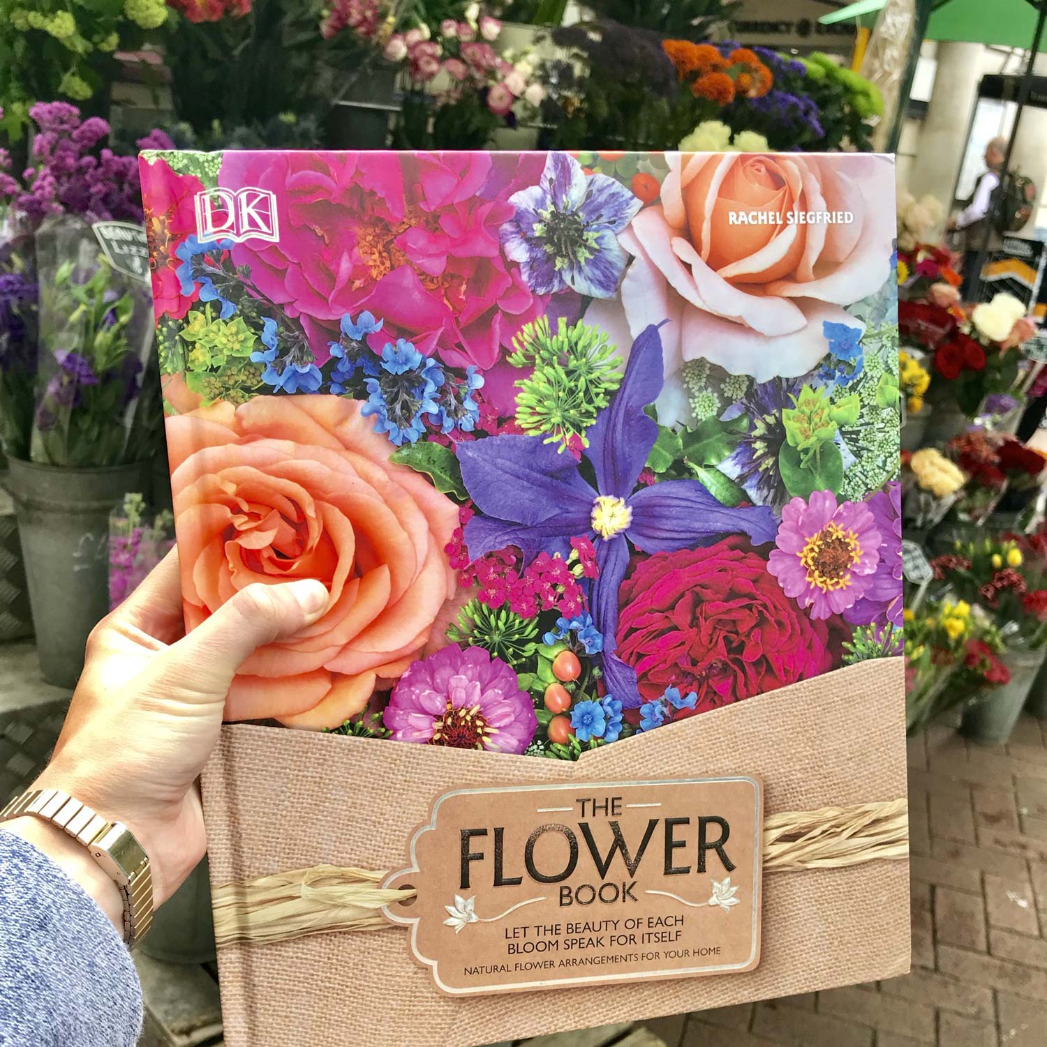
There's nothing like holding a DK book in your hand to really appreciate the quality of it. DK's website didn't have any photos or videos of the actual books, which is the next best thing. We needed to show off just how amazing our books are. Gloss finishes, die cutting, embossing, spot UV, foil and more need to be proudly displayed so visitors can get an idea of the quality, as well as the sizes of the books.
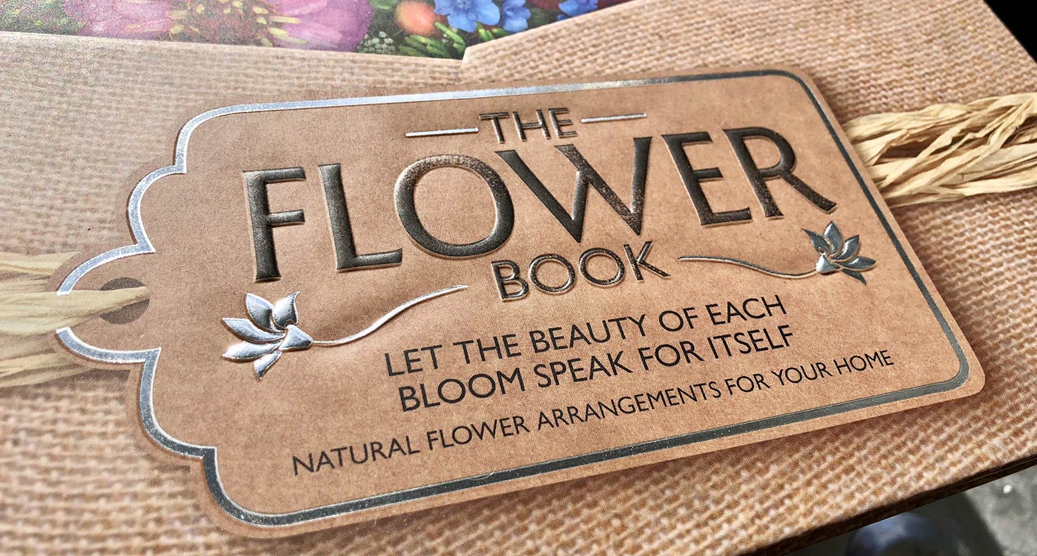
And a close up to show off the fantastic embossed foil detail in the title:
We were in the process of figuring out the best way to photograph (and video) books to use on the website. In the meantime, we started with a very basic first run with the amazing new travel books:
DK were a fantastic company to work with. Their commitment to great design in their books is inspiring and I enjoy trying to bring that into the digital world.