Designing logos isn’t a requirement of a web designer but if you can add it to your skills, you’re instantly more desirable for anyone who needs both a website and a logo. You can really add extra value to a client or project if it is something you can do, plus you get the added benefit controlling more of the design.
With that in mind, I thought it would be helpful to show you my logo design process.
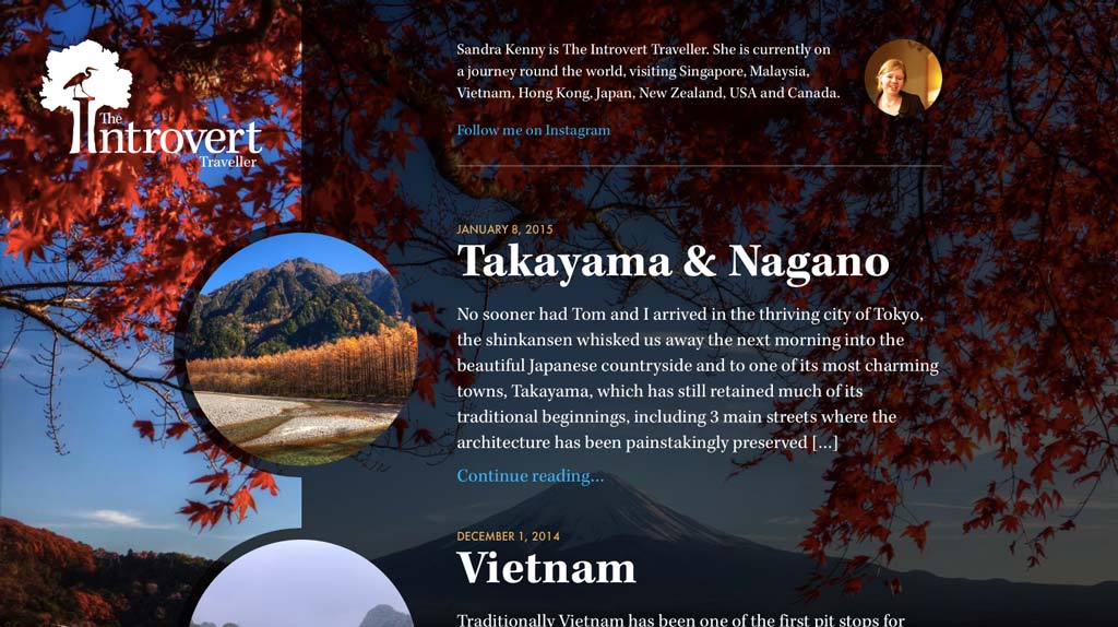
My wife Sandra started a blog to document our round the world trip and at first she simply setup a wordpress.com account and started writing. It’s great to see her get started with something but the designer in me wasn’t happy. I wanted to design something for her, so I set about designing a logo for her, followed by designing her own blog.
Before I Started
The first thing I did when my wife wanted a logo for her blog, was to learn more by watching. I hadn’t designed a logo for maybe a year to two, so I decided to watch a video by one of the best logo designers out there. I’ve mentioned it here on Inspect Element before, but Aaron Draplin’s logo design challenge is incredible.
The video reminded me of the best way to start. Start with the foundation of knowing exactly who your client is and exactly what they need. Once you have that, have fun experimenting to find the best option and don’t worry about the initial design because you’ll build upon them as you experiment. There’s very little chance of freezing at the blank screen stage with creative block if you start this way.
I started the initial discussion with my wife at dinner which isn’t your typical client meeting place but we came up with a few ideas to try. Immediately, I wrote them down so we didn’t forget them.
Getting Started
The title of the Sandra’s blog really says all I needed to start with but I know she writes well so I wanted to express that quality in the logo. These are the initial starting points:
- Introvert
- Traveller
- Elegance
That all I really needed to think about in order to start experimenting, as it already gave me a number of ideas. If you can clearly define what the brand is and who you are designing for, it will become much easier to narrow down your focus on ideas. In this case it was easy to start with but other logos may require more thinking at this stage.
What did require more thought, was the introvert aspect of the logo. Initially we struggled with something that could represent an introvert but I kept experimenting to let the ideas evolve.
What I knew I didn’t want to do though, was create something generic such as a plane flying round a globe. I’ve been in a position where a travel company picked a generic plane flying round a globe logo (not designed by me) over a better one. There’s value in the globe logo, sure. It does show a plane going round the world but let’s have a bit more fun, let’s be a more original and let’s create something a bit more memorable. That’s what I tried to do but unfortunately they went with the dull version and there was nothing I could do.
The First Idea
My first idea was to have a tree with the an “I” cutout starting the word Introvert with Traveller underneath. In my mind I hadn’t thought about where the word The would go but I knew I could figure that out by experimenting.
Time to Experiment
I’m going to take you through the stages of experimenting that led to the final design so you can see how it evolved and to show you how to quickly validate your idea and evolve it into something you’ll love.
Stage 1
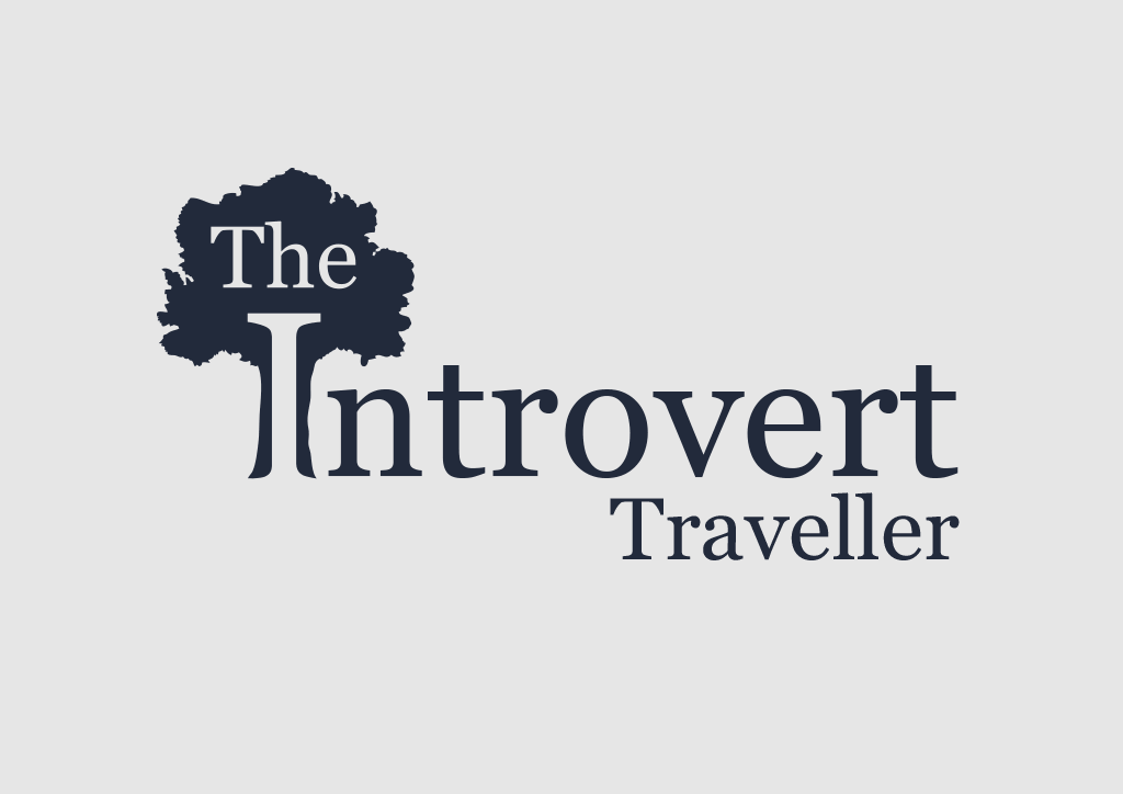
This is just a draft version of what our logo could look like. Most designers will start this stage by sketching, which is great, but I’m terrible at drawing, so I tend to head straight into Illustrator.
As you can see it looks incomplete but it at this point I knew it had potential. This is what this stage is all about. Get something onto paper/screen as quick as possible to see if your idea will work. Generally you can tell almost immediately if it will work or not and this way, you won’t waste much time finding out.
The initial draft version used Georgia because I knew the “I” had nice serifs that would make it stand out amongst the tree to make it more noticeable that it was a letter. As I knew this, I didn’t have to spend time trying to find a font; I just briefly used Georgia. A nice serif font would also be suitable to capture the elegance my wife and I were looking for.
I’m just testing the validity of my idea. Sometimes the idea can look terrible once you actually see it and this way, I won’t have wasted much time if I know it isn’t a direction I want to pursue.
Pro tip: Get your rough idea(s) down not screen/paper as quick as possible to see if they are worth developing or not.
Stage 2
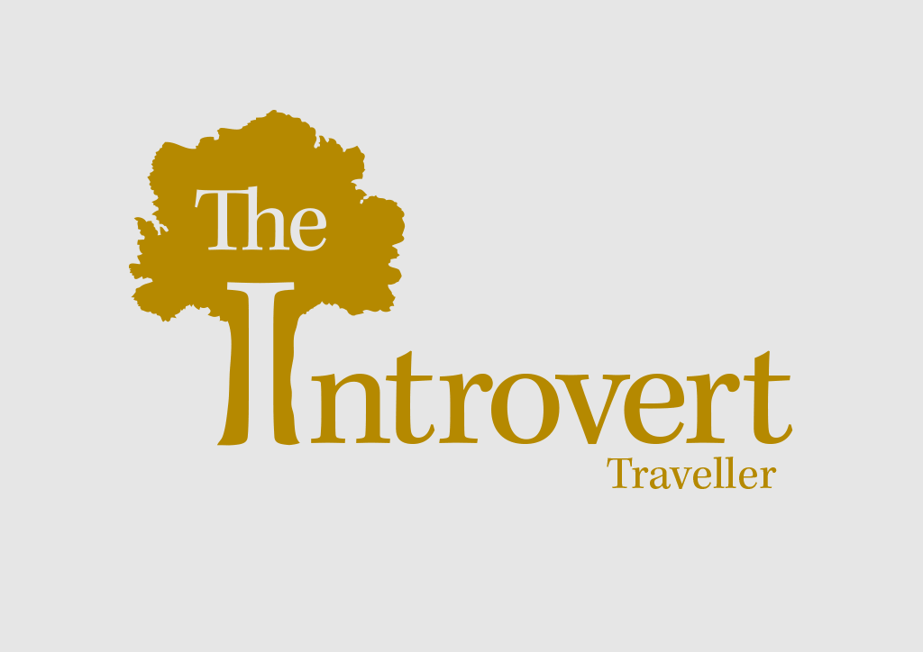
Georgia isn’t a suitable choice for a logo, so it was time to dump it and find something more appropriate now that I have validated my idea. Thank you for your help Georgia, but please step aside.
My first step in looking for a font was to consult Typekit. I wanted to use a font that I could use on the web as following the logo design, I will be designing the blog itself.
Font selection is almost always an arduous process of trying a number of different ones before finding the ideal match but luckily I stumbled across Kepler almost immediately. Maybe I could have found an even better choice but then it would definitely turn into an arduous process. It would have been tough to find something better so Kepler it is.
Notice how I’m playing around with simple colour changes. It’s fine to do so throughout the actual creation of a logo. I like to experiment with colour at the same time as designing a logo in order to make some progress with that too.
Pro tip: When you’ve found something that works really well in a design, don’t get bogged down trying to find something better. You can always come back to it later if you have time.
Stage 3
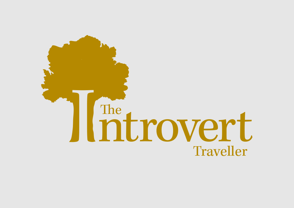
Now I have chosen the font and the overall layout of the logo in a good state, I could see something odd about it. The word “The” was drawing too much attention. It’s the most insignificant word in the logo, so it doesn’t need to be so big.
I noticed there was a nice little space where it could sit underneath the tree and above the word Introvert. Luckily I didn’t have to recreate the tree or find another one to achieve the same outcome as this one fit perfectly.
Right now, I could say I’m happy with it but it still lacks some personality. After, all this is for wife’s personal blog. I’ll start experiment with that in the next stage.
On top of that, the tree now looks a little empty. It doesn’t look bad but it certainly seems like the spot where I can experiment with adding some personality in the next stage.
Pro tip: At the first stage you think you’re “done” with a design, push on for a stage or two more to turn a good design into a great design.
Stage 4
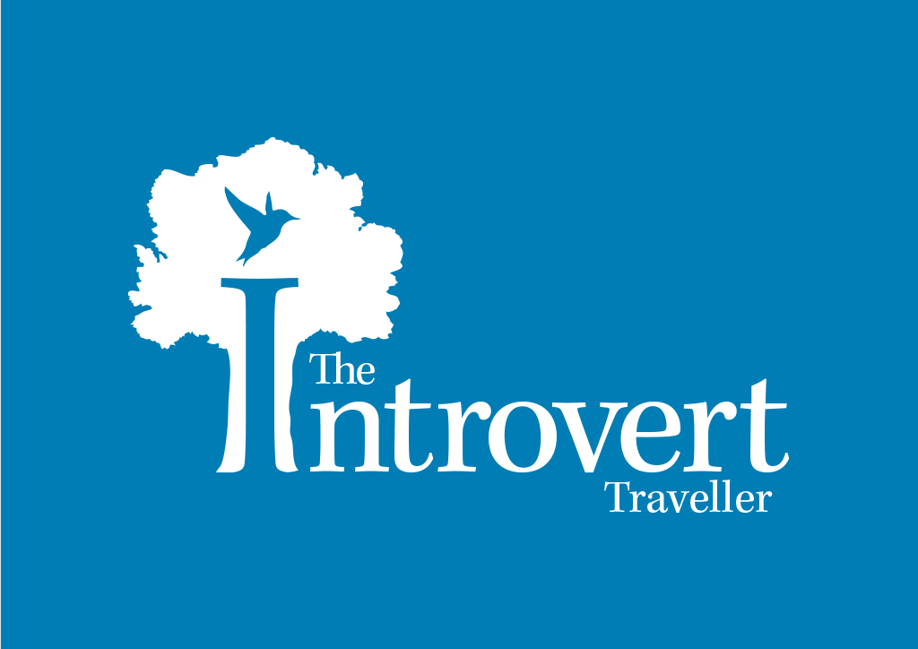
The first thing that came to mind was to place a bird in the tree so I started with a humming bird because of its cute and friendly look. It works well as you can see but I didn’t want to stop there because I’ve only tried one bird. Maybe there’s a more appropriate one.
The idea behind using a bird is to represent travelling. As we’re halfway through our year long journey, we know exactly how it feels by now and you really do feel as free as a bird.
For some reason, Sandra felt the humming bird look slightly aggressive. My first thought was how could you say that about a cute humming bird, but in a silhouette, I can see how it can look like that. It almost looks like it is ready to attack.
Pro tip: Include the client in the process at different stages. They can help you improve your work along the way by making it more suitable for them.
Stage 5: The Final Design
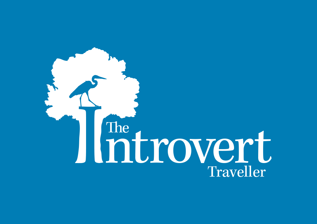
Thinking of a different bird was tough, especially as the humming bird looks great, so I went back to my original notes at the initial starting point with the words “Introvert”, “Traveller” and “Elegance”. We needed to find a bird that could express as much of those as possible.
Photography is one of my hobbies and for some reason, I have a little obsession of taking pictures of herons. They’re fascinating to me, especially the way their neck curls up into an s-shape. They look so elegant! Keyword found!
Not only this, I’ve only ever seen them alone, going about their own business. They seem very introverted. Another keyword! Of course they travel by flying so a heron is literally the perfect bird to use. I wouldn’t have discovered that if I didn’t look back to what the design needed to achieve.
Now I just need to fit a heron into the design. From a quick Google search, a flying heron doesn’t quite look as distinctive as when standing. The heron has to be distinctive in silhouette form in the logo, as well as at smaller sizes such as when used on the website.
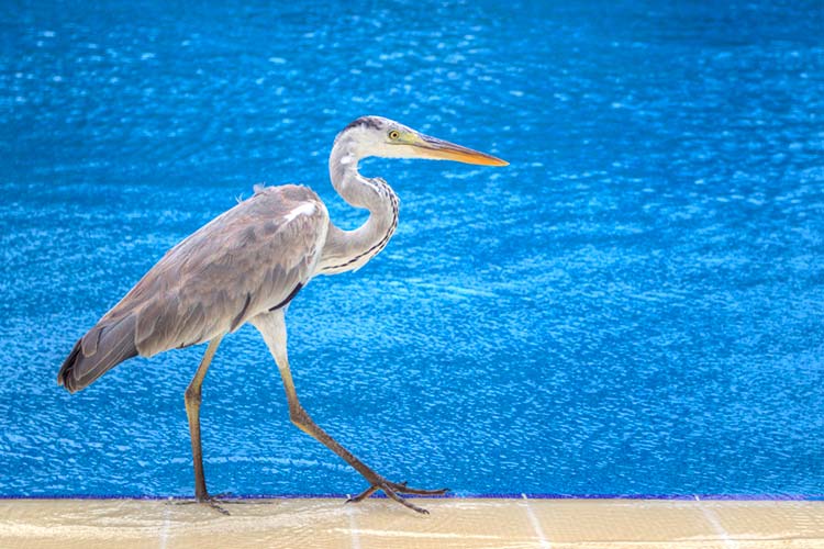
Once I made that observation, I knew I already had a photo I could potentially use to cutout out a heron and sit him proudly on top of the “I”. The photo above is from our honeymoon in the Maldives, so it turns out I unintentionally did some work on my honeymoon without even realising it.
The logo is complete. I’m happy I achieved the goals of the project and, most importantly, my wife loves her new logo.
Pro tip: Other creative hobbies, such as photography, can help you in your everyday design work.
Experiment, Experiment, Experiment
If you haven’t noticed, that’s the theme of this case study.
Experimenting is one of the key ways to overcome creative block. I didn’t struggle with creative block on this project because I always knew I should be experimenting.
Keep designing, keep experimenting.
